The other day, I was comparing service providers, and one of them rejuvenated my passion for overengineering (or websites that are so fancy it hurts).
The site loaded up quickly enough, but when I proceeded to scroll, it proceeded to boggle my mind by refusing my request. Turns out it was a fancy website with horizontal scrolling, which is cool—in theory.
The temptation to make your website stand out is a good one, but many things are cool in theory only. I say this from an all-around user experience perspective, not just for tech novices. (And if you have horizontal scrolling, no flack to you! I learn new things about UX all the time.)
There are two ways I see websites turn a uniqueness venture into a UX nightmare:
- Too many things! A lot goes into making a website. When you have 100 decisions to make, it’s easy to have a bunch of fun ideas. But your website shouldn’t feel like so many things are going on to your audience. Their experience should be smooth, and even 10 standout actions starts to feel messy.
- One thing that’s too much. Cue horizontal scroll → If your website isn’t a place people expect unusual behaviors (like the interactive weirdness that The Pudding is known for), then this is a break from convention big enough to lose a sale before it begins. Especially if other cues aren’t cuing your user in.
It’s better to let people use the knowledge they’ve picked up over the years by using websites than make them struggle and think. Your site can be super cool without having to train people to use it.
As Google says in its tips to improve your website:
“Include only what you need: For a new customer, unfamiliar websites can be very confusing.”
Why Simple Web Design (It’s Not Minimalism)
Choosing simplicity when it comes to your web design sounds like a snooze fest inspired by the strongest cup of chamomile tea (no hate for chamomile), but simplicity holds a lot of benefits for your business.
And when I say simplicity, I’m not saying minimalism.
Simple means removing the crap you don’t need.
Minimalism can be simple, but not all simple things are minimalist. The real question is whether all your fancy stuff serves a purpose.
Looking cool doesn’t count if it also harms the user experience. You could argue the whole point of looking cool is to improve the experience.
Plus, there are pretty sweet advantages to simplicity in design:
- Speed. Fewer files, smaller files, and simpler code takes up less server space and bandwidth, making things fast (and saving money, too, if you have a large or popular site).
- Scannability. With fewer distractions, your visitors can focus on the content that will actually sell them. One Nielsen Norman study found that usability improves with concise and scannable content. This research is old, but consider your own experience.
- Navigation. Cutting the clutter makes it easier to accomplish the goal at hand. Too many CTAs are a distraction. Multiple menus indicate room to improve.
- Accessibility! Beyond color contrast for color blind users and subtitles for the hard of hearing, websites that require too much action and interpretation are hard on those with cognitive and motor disabilities.
- Mobile-friendliness. How’s that fancy feature functioning on cell phones? Just curious.
- Maintenance. Simpler websites are easier to maintain and update. There’s less to run through when debugging, ensuring plugin compatibility, or upgrading your platform. If minor fixes take excessive time, your site’s likely overengineered.
- Money. Complexity increases development and management costs. You should pay when something adds real value, but when it doesn’t?
The Impact of Complexity and Prototypicality on User Perception
A Google study on how people form website first impressions found that visual complexity and prototypicality play crucial roles in aesthetic judgment (and do so in 17–50 milliseconds).
Visual complexity is what it sounds like, but prototypicality? That’s the mental image your brain creates to categorize each thing you experience, including websites.
And when something doesn’t match your mental image, you reject it consciously and subconsciously.
In sociology, prototypicality can get tricky, but in web design, it’s pretty straightforward. Your homepage should look like a homepage, and your blog article should look like an article. An insurance website should look like an insurance website and differ from a fitness apparel site or productivity tool. No one’s going to a Mexican restaurant for spaghetti.
We once increased conversions for a home insurance client by replacing their creative illustrations with real photos because it better fit people’s expectations of what an insurance company should look like.
When fancy doesn’t match a customer’s expectations for your website, even if they figure it out, it gets in the way of trust and dampens the overall experience.
Google’s web design research also found that visual complexity and prototypicality are related. When a website’s visual complexity is high, users perceive it as less attractive, even if it’s familiar. And when it has low prototypicality, users judge it as less attractive, even if it’s simple.
Now, The Role of Cognitive Fluency in Web Design
Cognitive fluency is the idea that your brain prefers to think about things that are easy to think about. (Unbelievable, huh?) So, the more work your brain has to do to process something, the more unpleasant it is. It’s why people prefer when websites come naturally to them, and they can focus on what they came for.
Likewise, the mere exposure effect states that the more you’re exposed to a thing, the more you prefer that thing (or things being that way).
Hence, throwing visitors for too big a loop isn’t ideal.
Another psychological principle with implications for cognitive processing in web design is Miller’s Law. In his article “The Magical Number Seven, Plus or Minus Two: Some Limits on Our Capacity for Processing Information,” George Miller shares that the average person can only hold about 7 (plus or minus 2) items in their working memory at a time.
Our working memory is where we temporarily store and handle information, which affects how we design and organize information on websites and website pages.
Of course, other researchers have since argued the number, advocating that the actual number is even smaller and people can process even less at a time.
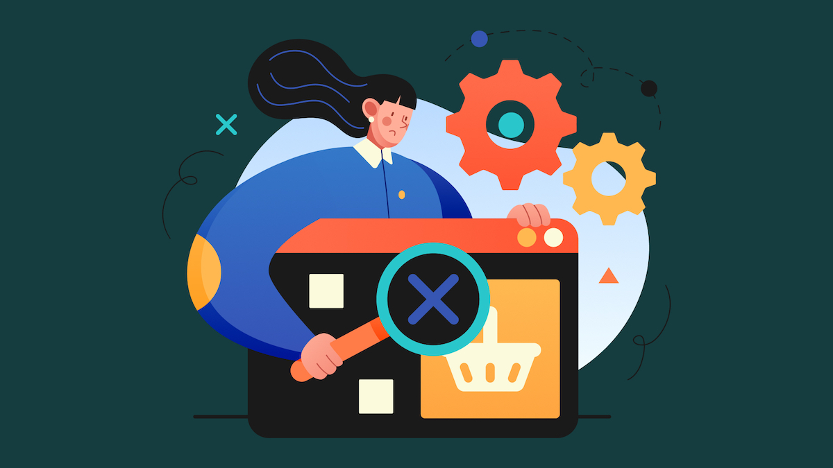
The Dangers of Overengineering
Stepping away from simplicity, let’s take a minute to address how overcomplicated or overly fancy websites occur. (AKA overengineering, from a business or development perspective.)
Overengineering can occur when:
1. Interfaces or features are overcomplicated in the name of perfection or ‘cool factor.’ I say “overcomplicated” because they:
- Don’t add real value and diverge from user needs.
- Overshadow the true purpose.
- Solve problems you don’t have.
If a feature only applies to a possible use case, not a real one, it’s overdesigning for an imaginary scenario.
2. The website building process is inefficient due to poor goal setting, planning, research, or not asking the right questions. This can lead to new ideas or needs continually getting tacked on, causing messy design that tries to accomplish too much.
3. The website has been around long enough to become a beast. In this case, new content or features may have been added without surrounding cleanup or the proper time to account for their impact on the overall site.
4. There’s a lack of ownership, so all new ideas are implemented without someone guiding what makes the most sense or considering what already exists.
Overengineering is a costly, easy trap to fall into. It causes feature bloat that confuses your average user and steals resources from more essential functionalities.
Examples of Overly Complicated Web Design
I couldn’t very well talk about overcomplicated web design without giving examples, could I?
Here are some examples that make my team want to use expletives when we see them (and they don’t contribute value):
- Horizontal scrolling or scrolling that initiates other actions
- Infinite scrolling without a ‘load more’ button or progress indicator
- Excessive parallax scrolling (too much can make it hard to focus)
- Intricate menu structures, hidden navigation, or hover effects
- Unexpected search function or menu locations
- Unintuitive layouts
- Lack of visual hierarchy
- Excessive animation
- Autoplay videos
- Complex or over-stylized forms
- Non-standard link styling
- Copy overlaying other copy
- Creative error messages that forfeit clarity
- Auto-rotating carousels that users can’t control or pause
- Multi-row carousels that move in opposite directions
- Header videos that prevent other interaction
- Custom cursors that make it hard to read or see where the mouse is
- Unpredictable inconsistency
But What About Being Unique?
The goal here isn’t to undermine your creative thunder or uniqueness.
It is to suggest that if you have a new idea to ground your decision in user needs and consult across teams.
And if you see something cool that you want to use to consult your strategy because people make mistakes, including designers of other sites. Find proof that the new way is better or test it, even if it looks like everyone else is doing it.
You can still stand out because your personality, product, and point of view are what make you unique, and every part of your website (typography, color, word choice, and valuable fun features) can speak volumes if you let them.
It’s most tempting to overcompensate when these aspects aren’t pulling their weight, but always adding more ‘stuff’ will eventually detract.
Compelling uniqueness stems from strategy and structure.
How to Simplify Your Site Into a Better Experience
Because we’ve got you, here’s a roundup of the tips that are going to help you impress in an awesome, effective way instead of a confusing, frustrating one:
- Make choices based on real user needs. Ask how it helps solve current user problems and what happens if you don’t do it now.
- Consider the potential impact on revenue and brand perception. Consult across teams on whether it aligns with goals. Weigh the long-term value.
- Gauge prototypicality and cognitive fluency. Does this change the value?
- Assess how features work with the current site, other features, and user journey.
- Account for site speed, device, and accessibility.
- Check what’s doable with developers earlier on. Involve them in actual use cases. Explain the why behind choices.
- Specify scope from the start.
- Ensure your team or agency has efficient processes. They should share how you can come prepared for each phase of the process.
- Establish clear product ownership and undergo scheduled maintenance.
Accounting for Audience
We’ve talked a lot about accounting for your audience’s needs but not necessarily who they are. Some of you, I know, have more than one audience. Some of those audiences have different needs and levels of expertise.
In these complex scenarios, a marketing website may offer simplified solutions up front, with options for the more savvy. However, such scenarios more often apply to tools and applications beyond the marketing phase.
For a travel site, this might look like a travel booking agent vs a regular user. For an insurance site, this might look like an agent vs insurance customer.
In these cases, design simplicity maintains its importance, but what’s simple varies with the user. So, you’ll need two experiences:
- A simpler experience for everyday customers you don’t want to overwhelm.
- A more capable experience for industry experts you don’t want to annoy or overwork.
And know that offering a more capable experience isn’t an excuse to over-engineer it.
The Fancy Website Tightrope
Before you scamper off, I need to mention the possibility of under-engineering. Like most things in life (are we even surprised anymore?), it’s about equilibrium.
There is the potential to fall short of expectations by doing too little and not accounting for all real, current use cases. And under-engineering can be just as harmful as overengineering, which is why it’s important to walk that fancy website tightrope.
Fortunately, unlike walking a real tightrope, your audience will tell you what to do if you listen.