
All businesses can benefit from more form submissions. You have probably seen it before: most traffic leaves before filling out a form, and of those who stay, not all complete it.
If less than 100% of your visitors complete your form, you have an opportunity.
Forms play an integral role in business. Sign-up forms, login forms, order forms, payment forms, feedback forms, patient forms, contact forms – forms galore! We need web forms to generate leads, increase engagement and expand.
Forms are the bridge between your website visitors and you, but they become barriers if not optimized.
Unless the form is filled out and submitted, it has failed to do its job. And unless the business makes good use of the form data it receives (e.g., getting back in a timely fashion, sending out newsletters, enriching form data for lead generation), the form is wasted.
Creating any old form is easy; creating a great form takes knowing what holds users back. Great web form design requires understanding how to effectively use all form elements: header, sub-copy, form fields, field labels, action buttons, and both corrective and affirmative feedback.
Manage that, and you’ll reap the rewards of a high-converting form. You’ll obtain more leads with the same amount of traffic, save money on marketing efforts and meet related business goals faster.
So, where to begin?
Ask Yourself: Should I Use a Form?
Start with deciding whether you should use a form in the first place. If the form isn’t providing enough value to you or your users, it’s better not to have it at all. There may even be a simpler way to get the information you desire.
Social media sign-up and login options have become a popular substitute for these forms because they save users from making yet another password. Its convenience increases a visitor’s chance of going through with the action at hand and staying on your site.
If you do decide that using a form is worth it, use the following tips to inform your strategy, and review your form using our Ultimate Web Form Checklist to ensure it’s as effective as possible:
Make the Motivation Clear
When users feel like they’re getting something worthwhile from a form, they are much more likely to complete it. It’s a matter of cost-benefit analysis: what will they get for putting in the time and effort?
The form design best practices in this article will make your forms more attractive, pleasant and easy to use, lowering the perceived cost of completion. Still, you can emphasize the value or purpose of your form to increase submissions. Will they create an account that allows them to do X, get a free trial or receive help? Whatever the user gets out of the exchange, make it clear.
A powerful headline, benefit-oriented copy and a direct call to action (CTA) can help. Don’t forget that persuasion is still at play.
If you want visitors to sign up for your newsletter, spell out the selling points. “Updates” is unconvincing. Updates on what? Do they get anything else? Tell them why they should care.
It’s also good practice to show how long your form is. If it’s short, show all the fields at once with the CTA button present, so they know how quick it will be. If it’s a longer form with several pages, include a progress bar, so they feel themselves closing in on the finish line. They will be less inclined to quit and waste their progress.
Observe Those Who Came Before You
Everyone has an idea of what a website form looks like, and these ideas are relatively consistent. This is because most web forms abide by general guidelines that make them look similar. It’s not by chance.
Web forms are everywhere, and due to the similarity in style and fields, people have expectations. Sticking to these expectations creates a sense of familiarity, safety and ease.
If you think a new field or form design will work, you can get a little creative. But if you stray too far from the norm, know that some users may get confused and abandon the form.
Prepare to Be Judged
Whether they are conscious of it or not, people judge by appearance. Businesses can’t escape this truth, making it all the more important that your website and forms are attractive and professional. It always helps to consider how your web form will fit in with the style of the page and website.
Two intro stylistic tips to keep in mind are space and readability.
Space: Make navigation simple by keeping a reasonable amount of space between elements. It should be clear what labels go with what input fields. Adding space also prevents a crowded appearance that can make forms feel more complex.
Readability: Space helps with readability, but form designers should also consider text choices, including easy-to-read and reasonably sized fonts. Always cut out all unnecessary details, and write at a reading level the average user comprehends. Using sentence case also improves readability.
Keep It Short
It’s easy to grasp for every little detail about the lead you’re acquiring, but you should only ask what you need to know. The more you ask, the longer the form, and the longer the form, the fewer submissions you’ll receive. Time is valuable, so respect theirs.
If there are fields you don’t need but are set on keeping, indicate which are required. Most companies indicate necessary fields with an asterisk. Users who don’t mind will fill out every field, but those uninterested in responding to additional fields or providing that much personal information can cut down on completion time.
You can also make forms appear shorter by condensing fields where it makes sense. For example, you can use one field for full names instead of two for first and last names.
Structure Forms With Logic
Effective web form design flows like a conversation. When structuring your form, imagine you’re speaking to your lead. Follow a logical order and group similar questions together.
Once grouped, arrange fields from easiest to hardest. People prefer to fill out easy information first, and once they have committed time to fill out most of the form, they are more likely to complete it.
Reduce Eye Movement and Confusion With Good Form Design
Limiting how much a user’s eyes have to move around makes your form easier to follow and reduces error and form abandonment.
Start by making it easy to tell what parts of the form go together. Labels for form fields should be right next to the field or above it – never below. Labels should also be closest to their respective field instead of equally between two fields. This helps users quickly discern what information goes where.
Use one column instead of two to make the form look cleaner and prevent users from zig-zagging back and forth. Then align text to the left so that it’s more natural to read.
Design Helpful Hints
There are helpful visual cues that you can incorporate into your form’s design to help guide users towards completion.
One of these cues is a field focus. It helps users know where they are at all times by indicating the box that’s selected. You can achieve this by highlighting the box with bold borders, color or other effects. You can also highlight the first field from the start so that users understand what the effect means.
Another common visual cue is a password strength indicator. If you’re designing a sign-up or account creation form, use this indicator to show clients the strength of their password as they’re creating it.
If you have an idea for a new design hint that will make your form more engaging and easy to navigate, test it out. Welcome innovation, but be willing to remove it if it’s not working.
Take Advantage of Prefill and Automatic Functions
Prefill, autocomplete, autofill and auto-formatting can cut down on form completion time while making the form easier to follow and reducing error.
Prefill is when you fill form fields with sample answers. The text is often lighter in color to indicate that it’s an example. Providing sample answers can clarify what goes in the field and the format users should enter it in. Whatever you do, don’t put the field label in the field itself. Once the user selects the field, the text will disappear, and it can be hard for users to remember what they have to enter.
Autofill uses user data stored in the user’s browser to fill out form fields automatically. This can reduce the number of fields a user has to fill out, but it can also be frustrating if it fills in the wrong information. Autocomplete, on the other hand, automatically completes a user’s response based on what they start typing. To take advantage of these functions, make sure to optimize your forms to use autofill.
There are also smart defaults you can implement. These defaults autofill information based on data the user’s prior responses. For example, if a user enters their city, the form may autofill the corresponding zip code.
Another automatic function is auto-formatting. When done right, it can minimize the need for copy instructions or sample answers. Auto-formatting is when the field formats the user’s entry as they type, so the user doesn’t have to think about whether they typed it in the right way. This is valuable for variables that often take on different spacing or formats, like dates, phone numbers and credit card numbers.
Use Conditional Logic
Sometimes form questions are irrelevant to certain audience segments and waste their time. Nothing is worse than filling out a form and having to answer or skip several questions that don’t apply to you.
If this is a possibility, consider using conditional logic. A form with conditional logic bases the questions it shows a given user on the user’s initial responses. This way, you provide users a personalized experience with only relevant questions.
Use the Right Input Controls
When designing forms, there are a variety of input controls you may use: attachment buttons, checkboxes, dropdown menus, radio buttons and more. It’s important to use the correct input controls for each purpose.
Checkboxes and radio buttons are often mixed up. Use a checkbox when the user can select multiple options from an array of choices or when you’re asking a user to opt in or agree to a statement. Use radio buttons when a user can select only one option.
When adding input controls, be sure to use them with ethics in mind. Using pre-checked boxes or toggles that confuse users or are easy to miss can be unethical. In some cases, it’s illegal.
Do Right By Form Buttons
Buttons are critical navigational elements. They are the key to submitting the form or making it to the next set of questions. Sometimes they help users switch to the correct form, such as when they’re on the login form but need the sign-up one. Buttons guide users in the right direction.
Buttons need to be visible, capture attention and be clear about their purpose, or the chances of form abandonment increase. CTA buttons should be big enough to see but not so big that they feel spammy. Some forms use color or drop shadows to help buttons stand out.
There are two vital buttons to a form – the primary and secondary buttons. The primary button encourages the main desired action and is always present. Not every form has a secondary button, but it’s often used to offer support when they do.
You can also use micro animations or copy affirmations to show users that the system registered their pressing of a button.
Make Errors Clear and Easy to Fix
Notifying users of an error without offering help is frustrating. User-friendly error messages provide solutions.
Always design forms to show which box contains the error, so users don’t have to scan the entire form over again. Inline error messages and validations work best. This is when a message appears right next to the error itself. You can also highlight the box or move the cursor to it.
If you can, be specific about the error, so users don’t have to guess what it is. Does the information not match your records? Is it due to a typo or symbol that’s not permitted? Perhaps they’re creating a password, and it didn’t meet length requirements. Whatever it is, tell them.
When there’s an error, share its presence right away. It’s more of a letdown for users when they finally hit submit, and the result they expect doesn’t occur.
Save Cache Data
Have you ever started filling out a form but got interrupted? Maybe your WiFi went out, the page reloaded or you accidentally exited the website?
Storing cache data saves users from starting the form all over again when these types of events occur. It protects them from the frustration of square one and increases chances of form completion.
Befriend Responsive Design Already
If you haven’t yet, it’s time to embrace responsive design. This goes for all areas of your website, including your forms.
Responsive design adapts to the device a user is on, ensuring your website always looks great and works. Now that over 90% of the global internet population uses mobile devices to go online, it’s critical that form usability remain consistent on these devices.
Yes, Accessibility Applies Here Too
We’re talking about it again, not just because it’s great for business and legally required, but because it’s the right thing to do. All websites and features of those sites should be accessible. It means making forms that everyone, including people with disabilities, can access and complete.
Accessible forms work well with screen readers and don’t rely on color. Using the color red alone to indicate a form error, for example, could be challenging for colorblind users to see.
For more tips, check out our guide on accessible design for users with disabilities.
Make. That. Copy. Work.
Forms aren’t all boxes and user entries. Good UX writing is essential for efficiently guiding users through any form. Form UX copy is present in error messages and microcopy like buttons, placeholders and labels.
Form copy should be short, instructive and easy to understand.
When writing form labels, use only the noun and ditch the verb (e.g., “Name” instead of “Enter a name”). It’s more straightforward and standard. For buttons, make microcopy outcome-oriented, so users know exactly what they’re doing (e.g., “Subscribe to newsletter” or “Get the PDF” instead of “Submit”).
As long as it’s short and serves a purpose, form copy can also provide handy details. Replacing “Name” with “Name as on card” or “Gift recipient name” can resolve user uncertainty and prevent error.
Another option is to add microcopy that explains why you’re asking for personal information if it seems out of place. You can share why you’re asking for a phone number or zip code and how you’ll use it if it’s not already apparent.
Negative words and phrases tend to make people stop and think, and positive wording is more friendly. Avoid words with negative connotations, like “spam,” even if you’re saying you won’t spam somebody.
Copy also contributes to a form’s flavor by making it feel welcoming and on-brand. While form fields need to remain instructional, form headers and other text can have fun with brand messaging as long the message is relayed.
Talk Privacy
Privacy concerns hold many forms back, especially as users become more educated on the threats of sharing personal information online. Users should be educated, and forms should take this into account.
About 29% of people cite security concerns as their reason for abandoning a form. If you have a privacy policy that protects the confidentiality of user data, let them know. Be understanding and soothe concerns so those in the 29% feel safe sharing with you.
Look at the Numbers
If you’re redesigning a form, you have the most valuable tool of all: data.
Review users’ history with your form and look for patterns. Where and why did users drop off? When users chose to leave can reveal an issue, whether a specific field caused the abandonment or they weren’t clear where a button was. Sometimes fixing one confusing element is all it takes, as was the case with Expedia.
When reviewing their form data, Expedia noticed that one specific form field was getting in the way of conversions. People would enter the wrong information and then weren’t allowed to proceed to the next step. So they deleted the field.
That year, they made 12 million in profit from the form.
A/B Test Form Designs
Companies shouldn’t only look at user history with forms; they should conduct tests to continue to improve. A/B tests, in particular, are a great way to keep upgrading your web forms.
To A/B test a form, create two exact iterations of the form in question but change one factor. It can be a header, a piece of microcopy, the color of a CTA or the removal of one of the fields. Use both for a specified amount of time and evaluate which one performed better.
Testing ideas for yourself is a good rule of thumb because what works for one company doesn’t always work for the next. For instance, some say that removing the phone number field on a form increases conversions. The only way to know if you will get the same results with your unique audience is to test it.
Decide: Single-Step vs Multi-Step Forms
Single-step forms are the standard forms that list all fields in one go. Multi-step forms split questions into more than one page. When the user completes the first, they go onto the next.
One study comparing a one-step and two-step form showed that 14% more people finished the two-step form. Other studies also claim that multi-step forms convert better, but the truth is that what works best for you will depend on why you’re using the form in the first place.
Single-step forms are best for collecting basic information and increasing submissions. They are less likely to scare off new users or visitors, which is why they’re often used for contact, support or login forms.
Multi-step forms are best for collecting several fields worth of information. Spreading the questions out makes the form look less daunting and more attractive. This type of form works particularly well when a user is already committed to a process, like buying a product. When ordering online, it makes sense to place billing steps on the following page.
When building a multi-step form, you don’t want the form to go on infinitely. Group some questions on each page, so there aren’t an excessive number of pages. Building out a multi-step form is an excellent opportunity to utilize conditional logic.
Regardless of which form you choose, implement the design and copy tips discussed in this article.
Decide: Chatbot vs Web Form
Chatbots are growing in popularity and can be a fun way to engage users and improve the user experience. They come with benefits like increased personalization and faster response times, and some businesses have started using them in place of web forms.
But whether a chatbot or web form will perform better for you depends on your business and users. You should embrace the future but not blindly follow trends. Try conducting a test to confirm whether you want to use a chatbot before diving in, especially since chatbots are no small investment.
We discuss the pros and cons of chatbots and forms and when to use them in our guide: Do Chatbots Convert Better Than Web Forms?
Secret Option Three: Natural Language Forms
Earlier, we mentioned that everyone has a similar idea of what web forms look like because of their long-standing similarities. Well, that’s not entirely true for the rare natural language form.
Natural language forms, or mad libs style forms, are written out as sentences with fill-in-the-blank options. Studies reveal conversion increases with these forms, but as with other form options, you’ll want to test it for yourself to see what works within your context.
The pros of natural language forms are that they are designed to feel more natural, engaging and personal. They borrow from the familiarity of everyday conversation and writing.
But there are several concerns. The format of natural language forms slows down scanning and isn’t what most users expect when handling a form. It can also create issues with literacy and confusion when translating across languages.
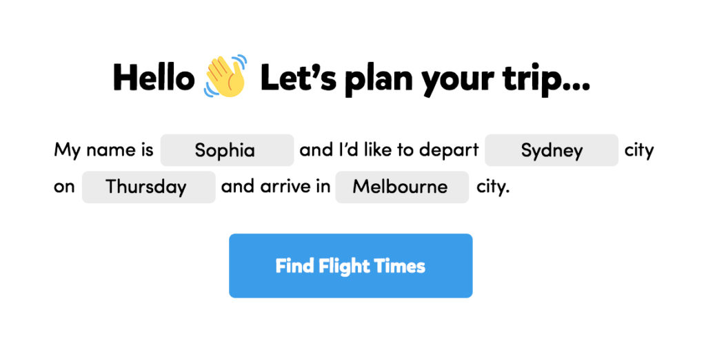
Example of a natural language form taken from The Theme Foundry.
Transform Your Forms Into An Experience
This header is a misnomer because all forms are an experience. But not all forms are a good one – and that’s the goal.
Having a form is no longer enough. A form needs to be persuasive, attractive and easy to complete. Just because a user wants what your form offers, whether that’s a white paper or an account, doesn’t mean they will fill it out. If a form is confusing or takes more effort than it’s worth, it will get abandoned.
Hence, the tips in this article. Use them to create great web form design with motivating microcopy, and watch your conversions rise.
Have questions about our suggestions or want to talk forms? Reach out.