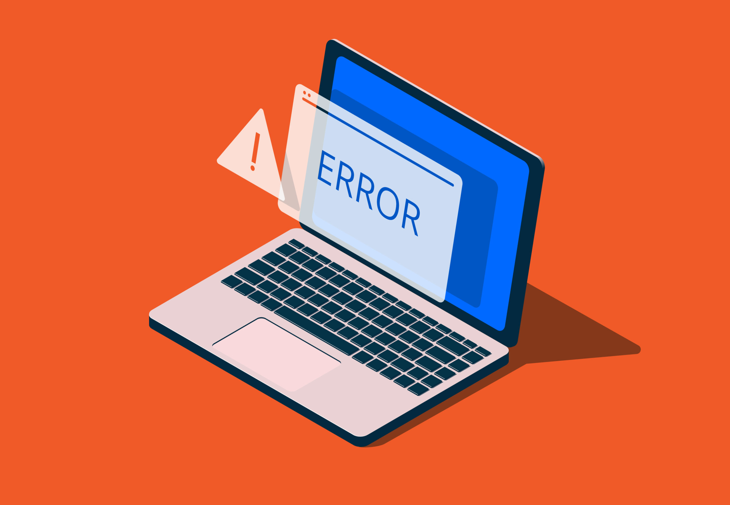
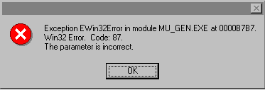
How hard could writing an effective error message be? There are a surprising number of ways this outwardly simple task can go wrong. Bad error messages are such a common problem in the user experience (UX) community that they’ve become a cultural meme. Know Your Meme even has a page dedicated to collecting lousy error messages and memes making fun of those messages.
It would be great if errors never occurred, but the world doesn’t work that way – and neither, no matter how good, does your digital application. Errors may result from the user, your system or even incompatible states, like trying to make a call while in airplane mode. Errors can be as simple as a typo and as prevalent as a broken link.
But as errors occur, you need to offer solutions. Hence, error messages. These messages are vital, and hopefully, you’re reading this article because you’re aware of the impact they have on your users.
Errors are frustrating to users. Your potential customer expects one result and, instead, gets a different outcome that interrupts their workflow. At this moment, they have to decide whether it’s worth it to continue interacting with your website – and even if it is, they may not be able to figure out how to move forward.
This is your chance to minimize frustration and provide a helpful message that promotes task completion. Writing error messages that solve problems instead of turning users away is another example of how good UX increases conversions.
Error messages shouldn’t be barriers; they should empower, reassure and guide your users towards success.
So, here are 15 tips on writing and designing good error messages that do just that.
1. Be Informative
When writing an error message, there are two components you have to include:
- What happened
- How to fix it
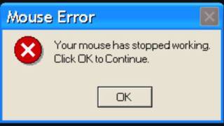
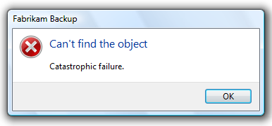
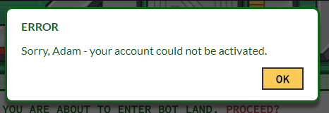
Claiming that there has been an error or mistake without explaining how to resolve it leaves the user without direction. An example would be telling a user, “Couldn’t rename file,” without telling them what to do next.
Telling the user what to do without explaining why there was an error might leave them confused about what they’re even fixing. In the scenario above, this might look like saying, “Please try another name,” without any explanation. Now they don’t know what was wrong with the name they chose and might even retry it.
A good error message would read, “There’s already a file with that name. Please try another name.” Now they know what to do and how to go about it.
Before you can write an informative error message, you need to understand the situation yourself. Start by asking yourself what has gone wrong, how it’s gone wrong, whether it’s a user or system error and how to fix it.
Some errors the operating system may control, so it’s also worth asking if it’s something you can change.
2. Always Provide a Solution
This tip branches off the first but is too important not to mention. You must always provide a solution to the error at hand. Otherwise, the user’s frustration will grow as they either waste their time trying to discover the answer on their own or give up.
Imagine a scenario where a user enters an invalid symbol in their username while trying to create an account. Instead of reminding them of the symbols they can use or sharing that it’s an issue with the username, your message reads, “You can’t create an account.” What are they supposed to do with that but leave?
When providing solutions, it is possible for there to be more than one option. For instance, a 404 error may be from a typo, moved content or deleted content. A useful 404 error page may encourage users to check their link spelling or take an alternative route to find the content they are looking for.
3. Speak the Same Language
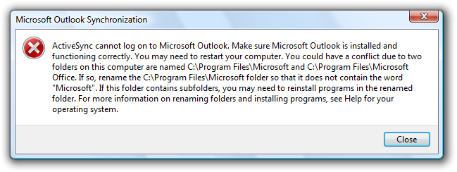
As with all UX writing or copywriting, you want to speak the same language as your audience. This means removing jargon or technical terms. You can be explicit about the error and what to do, but users can’t follow your directions if they can’t understand them.
A common issue among error messages is the use of error codes that users don’t have a background in.
4. Hemingway It (AKA Be Concise)
No one wants to read an essay for most things – let alone to fix an error. It’s a known fact that people skim where they can. Your users want to get to the point, and your error message copy should help.
Writing shorter error messages will also increase your users’ understanding. A study by the American Press Institute shows that readers understand 100% of a message with eight words but only 90% of a message with 14 words. Worse yet, at 43 words, comprehension drops to a mere 10%.
When you do cut words, make sure that you still get the point across. Remove everything the user doesn’t need to know, but keep necessary information. The goal is to be precise and concise.
5. Let Them Choose the Level of Disclosure
On the topic of being concise and speaking your users’ language, it’s true that most won’t understand the technical information behind a system error. Regardless, it’s nice to give the users who might find this information beneficial the opportunity to access it. You can do this with progressive disclosure techniques.
Progressive disclosure is when you add a “show more” or “learn more” link or drop-down option that reveals more information. This allows users interested in the details to view them without overwhelming those who aren’t interested.
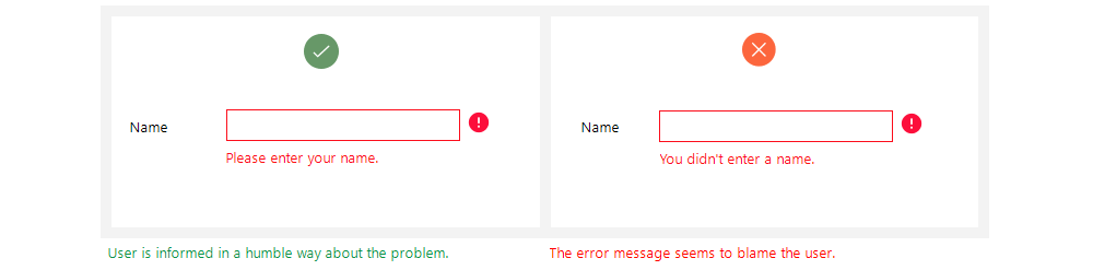
6. Take the Blame (Or Don’t Assign It)
It’s human nature to defend oneself, so it’s best not to offend users from the get-go. We’re talking about accusing users of causing the error at hand. Even if the user causes the error, you’ll provide a better user experience by not pointing fingers. This means taking the blame or not assigning it at all.
You can prevent accusatory language by focusing on the solution instead of the user action that caused the error. For example, your login error message can say, “That password doesn’t match. Please try again,” instead of, “The password you entered is incorrect.”
7. Be Gentle
WARNING: NO ONE LIKES BEING YELLED AT!
And yet, people often use all uppercase letters or exclamation points to convey importance. Instead, it can come across as aggressive or heighten the user’s stress about the error. When dealing with what may already be a frustrating situation for your user, be more gentle.
8. Use Positive Language
Using positive language when conveying errors can help soothe and guide your users, whereas negative language makes the scenario feel uncomfortable. Notice how “use positive language” sounds nicer than “avoid negative language” or how “be gentle” is more pleasant than “don’t be aggressive.”
Prioritizing the solution over the problem can help. For example, a form with an invalid zip code can say:
- The form has errors: You entered an incorrect zip code.
Or
- Please enter a valid zip code for your state.
Which would you prefer? We’re guessing the latter.
As long as you remain clear, giving your language a positive makeover can make errors less upsetting.
9. Use Your Brand Voice
Your brand is the core of your company, and it’s intended to prevail in all areas. Write error messages in your brand voice to help contribute to a seamless experience that makes the error feel like less of an interruption.
Of course, you want to keep the tone consistent with the user’s emotional experience. A fun brand can create a more playful error message so long as it remains helpful and doesn’t make the user feel like you’re not taking the problem seriously. Humorous error messages can relieve tension or frustrate the user more. It all depends on context.
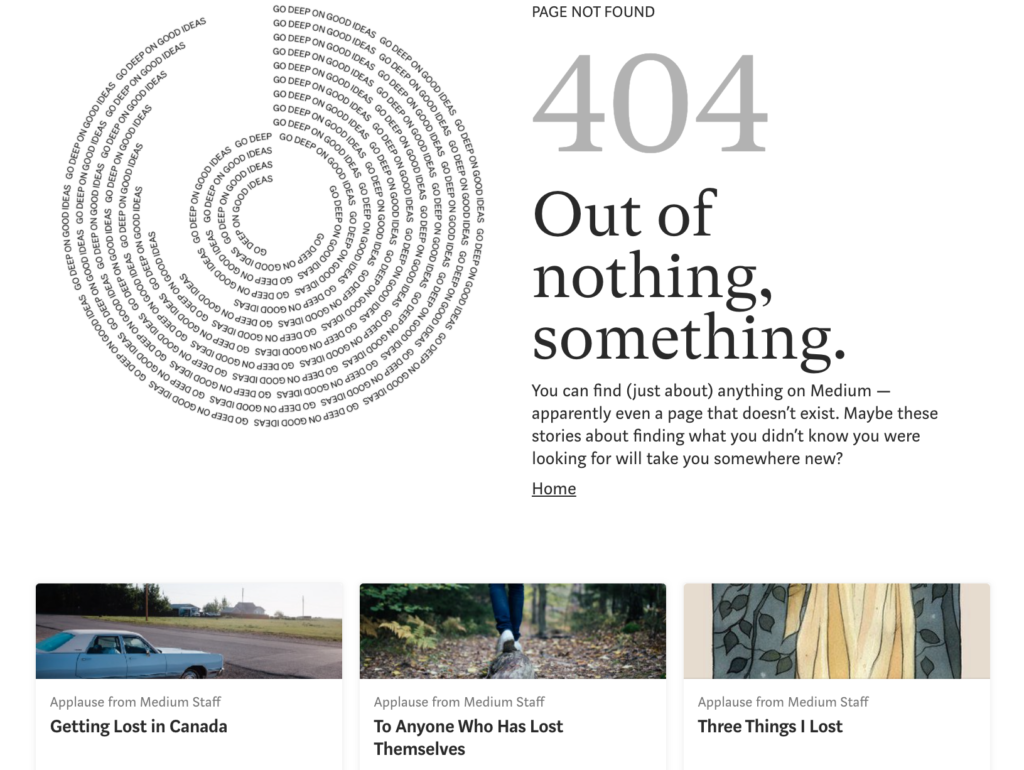
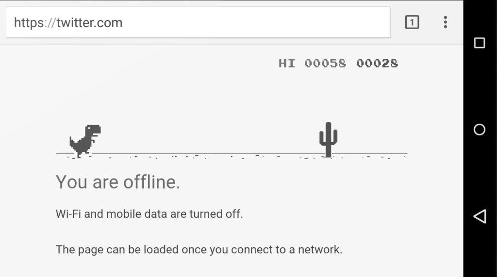
Some businesses replace generic error messages with creative alternatives. Google provides an offline game that users can play when disconnected from the internet. Medium, a publishing platform, uses its 404 Page Not Found error to say, “You can find (just about) anything on Medium – apparently even a page that doesn’t exist,” and links to intriguing articles about being lost.
10. Be a Friend, Not a Robot
It’s easy when conveying system errors to turn into a robot, but the best thing you can do is fight for your humanity. Making your error messages human and friendly humanizes the brand and makes it feel more like you care. Users prefer getting help from a person, and being friendly can remove frustration and generate understanding.
11. Make CTAs Clear
Depending on the content of your error message, you may need a call to action button (CTA) that guides the user, one that dismisses the message or none at all.
If you do use a CTA button, make it clear what the button does. Buttons like “yes,” “no” or “okay” might be too vague if not set up by the descriptive text. You may also have more than one CTA, at which point you’ll want to ensure that the user can distinguish between the results of each.
When writing an error message CTA, a good rule of thumb is to use the same text on the button that you do in the description. For instance, don’t say “erase” in the description and then write “delete” on the corresponding action button.
12. Account for Timing
Timing is another important element of how to make an error message. Will it be immediate? In post? The timing of an error message can be the difference between a helpful hint and an irritating occurrence.
More often than not, real-time alerts are more helpful. Picture filling out a form. You make a spelling error, and immediately after, red text appears next to the box asking you to include the missing element. Or, you fill out the form, hit submit and get a list of red errors to correct. Generally, users prefer the former.
13. Be Smart About Colors
Color is also a design element, but if you’re writing for UX, you should work with the UX designer to ensure proper representation of error messages.
Color is important to friendly error message design as it plays a large role in drawing attention to the message. But using attention-grabbing colors isn’t the only thing to consider. You also want to ensure that your message will be visible to people who are color blind. This includes using appropriate color combinations and icons to help indicate errors.
Refer to our guide on UI design for color blind users to make your error messages, and the rest of your platform, accessible.
14. Consider Format and Location
When designing error messages, you’ll also decide on the format of the message and where it will display on the screen. Is your message so urgent that it should take up the entire screen and prevent all other action so that users have to see it? If it’s more of a minor notification, interrupting users to such a large degree may be annoying. A newer, less disruptive practice with forms is to take away the option to hit submit until users correct all errors.
You can display error messages as full-page pop-ups, banners or inline errors. The type you choose will depend on the context and severity of the error. For example, inline messages are ideal for forms as they notify the user of the error right next to the error itself, making it easy to spot and correct.
15. Prevent Error From the Start
Some error is inevitable, but you should prevent it where you can. With empathetic design, you can reduce the number of error occurrences to create a more seamless experience.
You can start by creating a customer journey map that reveals where errors are often made. Then, see if it’s possible to make design edits that prevent those errors. Here are some design elements that reduce error:
- Crossing out booking dates that aren’t available so users can’t select them
- Autocorrecting typos (careful with this one)
- Using white space to prevent misclicks or mistaps
- Clearly labeling forms
You can also reduce repeat errors by providing better direction. For example, many users have multiple usernames and passwords. “That username doesn’t exist,” provides better direction for what to try next than saying, “Your login information is incorrect.”
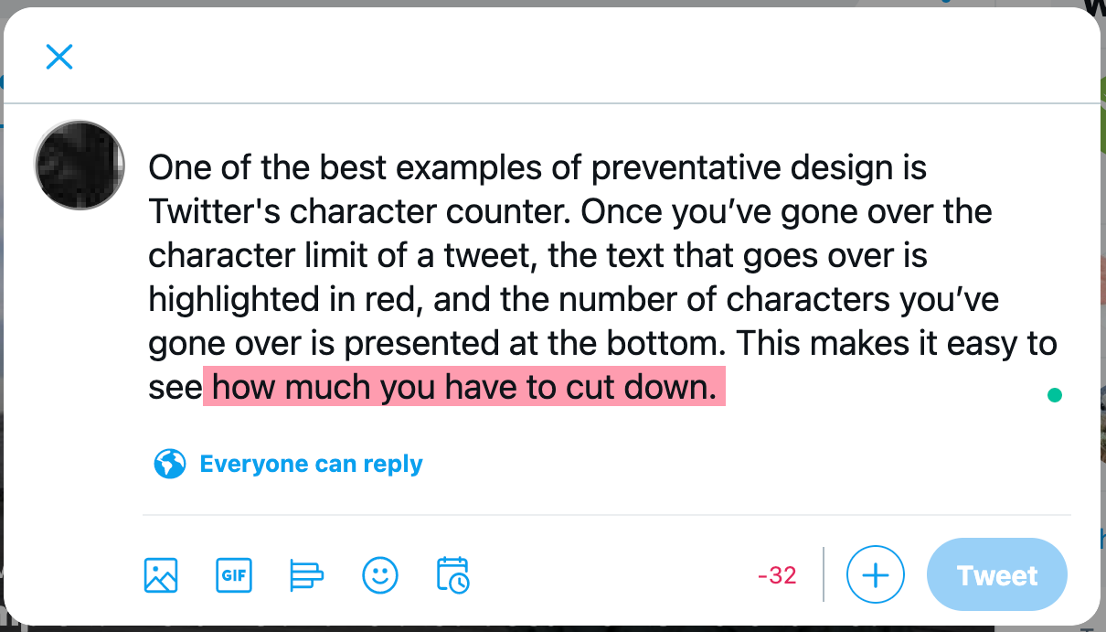
One of the best examples of preventative design is Twitter’s character counter. Once you’ve gone over the character limit of a tweet, the characters that go over are highlighted in red, and the number of characters you’ve gone over is presented at the bottom. This makes it easy to see how much you have to cut down.
Go Forth and Conquer All Error
If you’re ready to start creating effective error messages that empower your users instead of irritating them, start by knowing what errors you’re helping with. You may be starting from scratch, have error messages to rewrite or just making sure that you have all bases covered.
Sometimes the best error messages aren’t necessary but are worth investing in to help the user experience. Some email platforms notify you that your email doesn’t have a file attached when you mentioned attaching one in the email. They aren’t obligated to catch this forgetful moment, but it sure helps when they do.
Evaluate all elements of your software or website, and make a list of all the places something can go wrong or users can mess up. Once you’ve done that, use these 15 tips to write user-friendly messages. And if you need some help, reach out.