Imagine you’re at a new theme park, looking to get from point A to B.
“Start Your Journey,” a sign says with a big whimsical arrow. You walk in that direction, but another sign interrupts. “Don’t Forget a Souvenir!” it says.
You follow the original arrow until more signs appear:
“Satisfy Your Hunger” and “Sweet Treat, Anyone?”
The next thing you know, you’ve strayed from your path.
Likewise, you have to be smart about the ecommerce call-to-actions on your website.
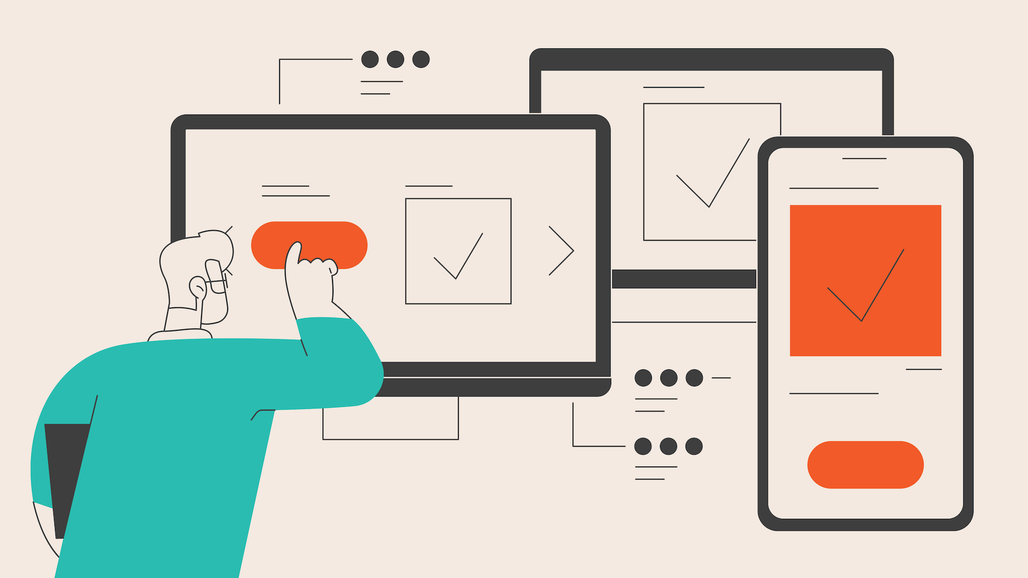
The Importance of How You Present CTAs on Your Website
Calls to action influence behavior, guiding your leads to become paying customers and your customers to become loyal patrons.
In the fast-paced online world, you’re not only fighting for peoples’ attention (even on your website) but also their desire (or lack of) to purchase your product.
When your site has too many, too few, or misplaced CTA buttons, you risk disrupting your visitors’ focus as they move through your website.
And the second you distract a visitor from converting, the sale zips by like a rollercoaster.
Why Too Many CTAs Is a Problem
You might think increasing the number of CTAs on your page will increase your clickthrough rate. The more click opportunities you present visitors, the more likely they’ll do it, right?
Not quite.
Too many buttons can confuse, overwhelm, and distract your visitors. You may want them to “Shop Now,” but the secondary CTAs “Learn More” or “See What Others Are Saying” are stealing their attention.
In some cases, these extra CTAs are beneficial. But when they’re not, it hurts your CTR and conversion rates.
And even if your visitors do click, more CTAs mean more opportunities to click something other than the primary CTA (the action you want them to take above all others).
Why Too Few CTAs Is a Problem
Sometimes, your web page needs more buttons. Remember walking into the theme park for the first time? Imagine there weren’t enough signs to get you to the main attraction.
As in our analogy, too few CTAs can frustrate visitors expecting there to be guidance.
The last thing you want to do is take away a chance to convert from a lead who wants to because they can’t easily find where to go.
Think of a long, scrollable homepage with several actions. Pages like these may call for multiple CTAs to ease the customer through the physical site or sales funnel based on where they are in their journey or how high-ticket your product may be.
So, How Many CTAs Does Your Ecommerce Site Need and Where?
The number and placement of CTAs you need on any page of your site depends on your goals for that page. Naturally, that changes with each business and each page.
Your goals should inform the type of visitor you’re leading to that page and where you’re guiding them next (aka your page layout and CTAs).
Number of CTAs
Certain pages call for one CTA, like landing pages or contact pages that are focused on one action and include all the need-to-know information on that page.
These are instances where you don’t want to overwhelm or distract your visitors with options beyond the singular action you want them to take.
On the other hand, pages like homepages and category pages may offer several ways to proceed and feature more than one CTA.
CTA Placement
More people are scrolling past the fold on today’s internet, but that doesn’t mean everyone is scrolling to the bottom.
As a general rule for ecommerce sites, we recommend placing your primary transactional CTAs in the first two screenfuls of your pages.
Where you choose to put related and additional buttons, including duplicates of the primary CTA, depends on your goals for the page.
We’ve heard others suggest that CTAs depend on the length and content of your pages, but, in reality, they should be decided simultaneously.
When we develop the information architecture for a client’s website pages, who is coming to the page and where we want to lead them determines the CTAs and the content that should engage them.
Types of CTAs to Help Reach Your Goals
Knowing the different types of CTAs will help you determine if the ones on your pages align with your strategy for those pages.
Regarding UI, CTA designs range from large, colorful buttons to modest hyperlinks. A sticky CTA is another type of button that stays at the top of the screen as you scroll down the page. What you decide for your CTA design depends on your branding and goals and ultimately influences your user experience.
Common CTA examples for ecommerce goals include:
- Try for Free: Great for acquisition strategies where you offer a physical sample or a trial of a digital product.
- Shop Now: Suitable for acquisition and retention strategies, these CTAs encourage interested shoppers to check out available products.
- Buy Now: These buttons get right to the point and are suitable for acquisition or retention strategies when there’s one product being considered.
- Sign Up or Subscribe: These buttons build lists for email and SMS marketing strategies or encourage final sales for subscription-based services.
- Learn More: These buttons contribute to awareness strategies and are the least urgent for users.
- Share: Also contributing to awareness strategies, these broaden reach by encouraging visitors to share your content with others.
However, your site can use copy-variants of the above CTAs to better align with your brand or what you sell. An insurance company would encourage a quote over a purchase. You might say “Contact John in Sales” instead of “Contact Us.”
The options are endless, but the key is to provide clear expectations for what happens after clicking.
We can also rank page CTAs by priority:
- Primary CTAs: These buttons indicate the main action you want your visitors to take.
- Duplicate CTAs: This is one way to refer to repeats of your primary CTA on a singular page. Duplicate CTAs (within reason) can increase conversion rates, especially on lengthy pages.
- Related CTAs: These buttons are close in importance to your primary CTAs but are used to capture audiences in different parts of the customer journey. For example, a software company’s homepage may feature a “Buy Now” and a “Book a Demo” CTA next to each other to capture both ready and interested visitors.
- Additional CTAs: These buttons are your secondary, tertiary, and so on CTAs that change depending on the page they appear on. For example, a secondary CTA on your homepage may be the primary CTA on your about page.
Ecommerce CTAs in Action
Let’s view a few ecommerce call-to-action examples in different applications. Every business’s circumstances differ, so these examples are only a reference.
Homepage CTAs
As an ecommerce business, you always want your primary CTA above the fold on your homepage.
But you might include more CTAs lower down to help visitors at various stages of your journey explore your website and learn more about your company or offerings. For example, you might want to help potential customers “Learn More” about your products or current customers to “Sign Up” for a VIP membership or “Call Customer Support.”
With more information, you may strategically place duplicate CTAs to remind visitors what you want them to do most without requiring them to scroll back to it.
The calls to action here should be determined based on your marketing goals for your website in order of priority.
Example of Homepage CTAs
Take the water bottle company Owala’s homepage as an example

Immediately, there’s one prominent “Shop Now” button as the primary CTA. You’ll find that not many others are needed since its top goal is to sell water bottles.
Owala used its primary CTA to promote its Marvel-themed water bottles, but the overall message is to look through the company’s products in the hopes that you find something you like.
The second screenful has another shop-related CTA, but this second version consists of three “Best Seller” categories to shop.

Meanwhile, their footer switches things up with the secondary CTA “Sign me up!” under the mini-header “Join the Club.”

It makes sense for this CTA to be in the footer for a couple of reasons:
- It’s a secondary CTA. Owala is trying to sell water bottles above everything else.
- It’s out of the way. Because it’s prominent in the footer, this CTA captures the most interested visitors (those willing to look this far) without taking up valuable screen real estate where other visitors are likely just trying to buy.
However, this CTA could still improve: If Owala were our client, we might suggest updating the header or adding a short line of copy to explain what you get by joining “the club.” Visitors may not know whether it’s a membership, rewards club, newsletter, or something else.
Product Page CTAs
Traditional product pages feature information about one offering, including images and videos, a product description, pricing, features, and social proof. However, product pages for more complex offerings may include more information.
These pages may only need a primary CTA (e.g., “Add to Cart”) but may include others, such as CTAs to similar or related products.
Reviews and product comparisons should often be on the page itself to not remove visitors from the purchase journey.
Example of Product Page CTAs
Let’s look at one of Owala’s product pages as an example.

Above the fold, Owala encourages visitors to add its FreeSip water bottle to their cart. This is the primary and only CTA here because it’s the primary goal for the page.

In the second screenful, Owala uses the header “Frequently bought together” to introduce its secondary CTA for buying three similar products: “Add All: $82.97.”
Customers in the consideration stage looking for the product information below this button might explore these complementary products. Existing customers may also come across this CTA button should they scroll just below the fold.
But there’s another CTA yet.
The bottom right of the product information has an unassuming “See PDF for details” button, for new customers trying to learn more about the product.
About Page CTAs
Of all ecommerce pages, about pages might have the most free rein.
Some companies use CTA buttons to teach new visitors about their brand’s values and accomplishments. Others may further encourage sales with a “Shop Now” CTA.
However, many businesses will leave CTAs off of their about page, which is a missed opportunity to encourage further engagement. Even one CTA here can point users to:
- View your top services
- Read your most popular blog or social media posts
- Browse your best-selling products
- Sign up for your membership or newsletter
- View upcoming events
- And the list goes on…
Example of About Page CTAs
Personal care product company Burt’s Bees displays a rich story on its about page, featuring several “Learn More” CTAs.
Above the fold, there are no clear CTAs outside of the nav bar. The company wants you to continue scrolling.

If they were our client, we might suggest using a design element in this first screenful to help more clearly indicate the page continues below, but the second screenful is different.

Here, there’s a “Keep Reading” CTA beneath a paragraph on the company’s origin for those who want to learn more.
Linking out to the main content is less overwhelming than having it all on one page and allows visitors to choose what they want to learn more about.
They also include three tabs a visitor can switch between: “Born Different,” “Seriously Good Stuff,” and “For Nature. For All.”
Why are we talking about page content in an article on CTAs?
Because the content on each tab targets what different types of visitors might care about, and the CTAs in those respective sections match their intents (e.g., a “Find Your Solution” CTA under “Seriously Good Stuff).
Perhaps most importantly, all of the above results in a shorter scroll to the bottom of the page, where they feature products the customer can purchase—the money-makers.

This is a great example of using an opportunity to sell even on the about page.
What Will You Call to Action?
CTAs are your visitors’ North Star, helping them reach their next destination.
But more important than having CTAs is knowing how to wield them for an optimal user experience that leads to a pleasant conversion.
An effective ecommerce call-to-action needs conviction, and where you place it needs to make sense. It should not add clutter and never break your audience’s focus from the goal at hand.
You can read about CTA button best practices all day, but when it comes down to it, how many belong on your website pages and where can only be decided by evaluating your specific goals and customer journey.