
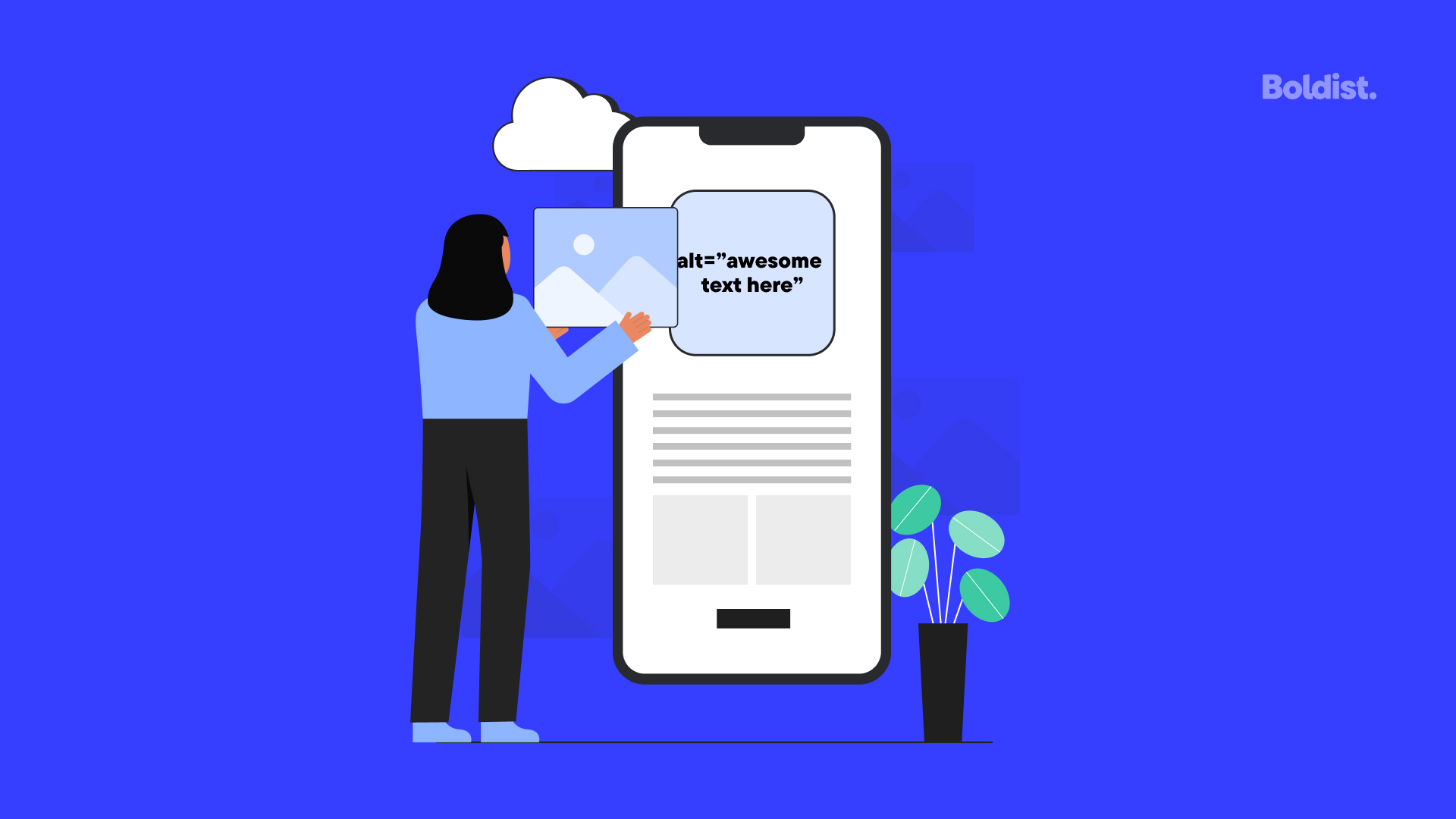
Alternative text – also referred to as alt text, alt attribute, alt description and, more accurately, alt tag – is the invisible description of images in the code of a website that describes the appearance and function of an image on a screen.
Alt text is used in a variety of ways: it will appear in place of an image if the image fails to load on a web page; it is used in SEO, by helping search engines index your images accurately; but, most importantly, it is used to describe an image for people using screen readers, especially the blind and visually impaired.
Internet Accessibility as a Human Right
A United Nations declaration in 2016 called for “applying a comprehensive human rights-based approach when providing and expanding access to the internet and for the internet to be open, accessible and nurtured”.
Of the US population, 2.4% are visually impaired, and many of them use screen readers to read your web pages out loud and access the internet. And while making visual content available in a text format is one of the first things designers learn when they venture into the topic of website accessibility, many of them do it poorly.
As many problems as the internet has brought forth, it has solved so many more – and we share the U.N.’s belief that internet access and accessibility is a fundamental human right. More than that, accessibility can become a legal issue, and you will want to ensure that your website is ADA compliant.
We have previously highlighted the ways you can make your website more accessible to the deaf and HOH community, but to make it more accessible to the blind and visually impaired, you need to ensure that you have the appropriate alt-text attributed to the images on your website.
Channel your inner Hemingway, use your words sparingly with little fluff, and practice writing great alternative text.
Best Practices When Writing Alt Text
Alt text is a simple, short description. You should use spaces between words, and you can use punctuation to make text easier to understand. Sometimes it is okay to have an empty alt attribute, for example: when using an image within a link, if the link text is the same as the alt text, leave the alt tag empty to avoid repetition and redundancy. (alt=””)
It’s not just images that need alt text; you should add alt text to your buttons too. The point of alt text is to tell a blind user about the content’s function and purpose. So a form submission button should have the alt attribute <input type=”image” alt=”submit button”>
How to Write Great Alt Text
Be Concise
When writing alt text, get to the point. There’s no need to say “this is a photo of…”; screen readers are already able to understand through the image source tag, expressed in HTML as img src, that it is an image. You’re just describing the image.
Be Descriptive but Don’t Go overboard
You’re providing context to the person using a screen reader, so your descriptions should help them to understand the content. Saying that an image of an apple is a “green apple” is simple enough and acceptable; “green, Granny Smith apple” is better; “a green, Granny Smith apple with a stalk pointing to the left and a bit of a shine to its skin, set against a white backdrop” is just overkill.
Use Keywords
The additional benefit of alt text is that it helps with your image SEO by making it easier for search engine crawlers to understand and catalog your images against the content and context of your web page. It would be negligent if you didn’t include a relevant image for your target keyword that also included the target keyword in the alt text.
No Keyword Stuffing
Remember, the goal of great alt text writing is to improve accessibility for visually impaired users using screen readers. Stuffing your alt text full of all the keywords you’re trying to rank for will make for a bad user experience and will, inevitably, be penalized by Google by depreciating your Search ranking.
Don’t Use an Image of Text
Screen readers cannot transcribe from a JPG, so make sure that you use CSS to style your headings rather than using bitmap images. Whenever possible, don’t use an image of text in place of actual text. For example, if you’re a restaurant, have your menu coded in text and then styled rather than just uploading a photo of your printed menu.
Exceptions to the Rules
Sometimes we come across websites that put up an entire jpg of a flyer and it gets us down. The problem with text in images, especially images that convey important information, is that it is unable to be read with a screen reader. There is no benefit to this – screen readers and search engine crawlers can’t read the information. If the information is written out on the website and then coded to the design specifications, it can still be read by screen readers.
The exception to this might be your company’s logo if text and design are integral to the display of the image. In this case, you would use an alt text tag that is just your company name.
Another exception are instances where text is crucial to the image you are using. For example, a photo of a handwritten letter. To maintain compliance, the letter should also be transcribed and written on the web page elsewhere, and the alt-text should still be brief and succinct to tell the reader about the image.
If you’re struggling to write alt text, understand that at the end of the day the goal is to make the web more inclusive, so the resolution will normally come from imagining what is in the best interest for those that benefit from alt text. And while you’re making your website more accessible, consider how you might also make your social media more inclusive to the visually impaired.
We’re trying to make the internet a more inclusive and better place, with awesome websites and great UX design. If you’re interested in working with us to improve your company’s accessibility and design, reach out.