An improved checkout experience helps customers complete the purchase, but a poor experience can lose you the conversion.
Customers want a fast and transparent ecommerce checkout process that offers support, emphasizes privacy and security, and provides detailed order information.
The last thing you want is for a customer to change their mind about a purchase millimeters away from the checkout button.
Consider these stats:
- The average cart abandonment rate is 70.19% as of 2023.
- The average ecommerce conversion rate is 2.04% as of August 2023.
- Mobile cart abandonment was 12% higher than desktop cart abandonment as of 2022 .
- Forty-eight percent of consumers abandoned their cart because extra costs were too high and nearly a quarter because of forced account creation in 2022.
You can see that cart abandonment is rampant, and conversions are paltry. Consumers are fickle, and with the amount of products and stores available online, they have a right to be.
But after spending time, effort, and money on getting your prospects interested in your product, you want to drive the sale home. A pleasant checkout experience is the difference between a sale and lost revenue.
Consider the following insights and examples when focusing on ecommerce checkout optimization. The goal is to initiate a quicker and easier experience without compromising the information needed to process an order.
User Experience Best Practices
Indicate Checkout Progress
Most people know the order of the checkout process by now:
- Add items to the cart
- Give billing, shipping, and payment info
- Preview the order
- Make the payment
- Receive confirmation
But because every ecommerce site is different, new customers may not know what to expect on multi-page checkouts.
You can use a checkout progress indicator like a progress bar, breadcrumbs, or labeled tabs showing the next steps to alleviate the uncertainty.
Examples of Progress Indicators
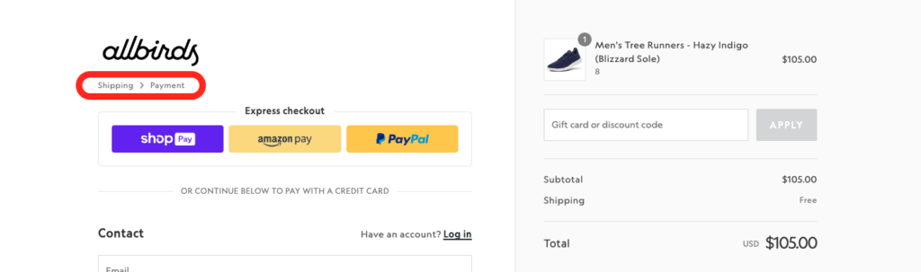
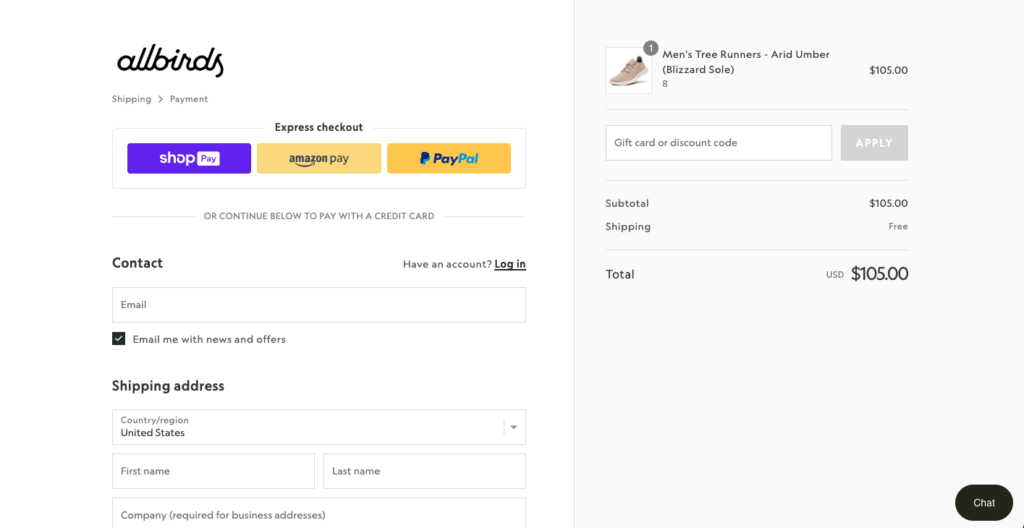
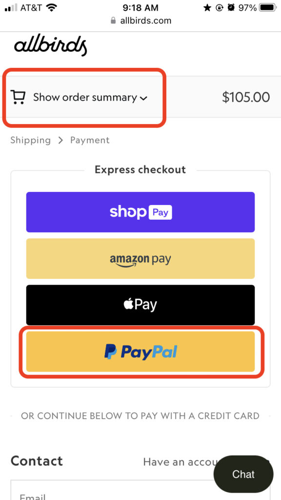
The Allbirds checkout page has a breadcrumb trail in the top left indicating that the user still has to provide shipping information and payment details before they can complete the purchase. It works because it’s visible against the white space and helps the customer know where they are in the checkout.
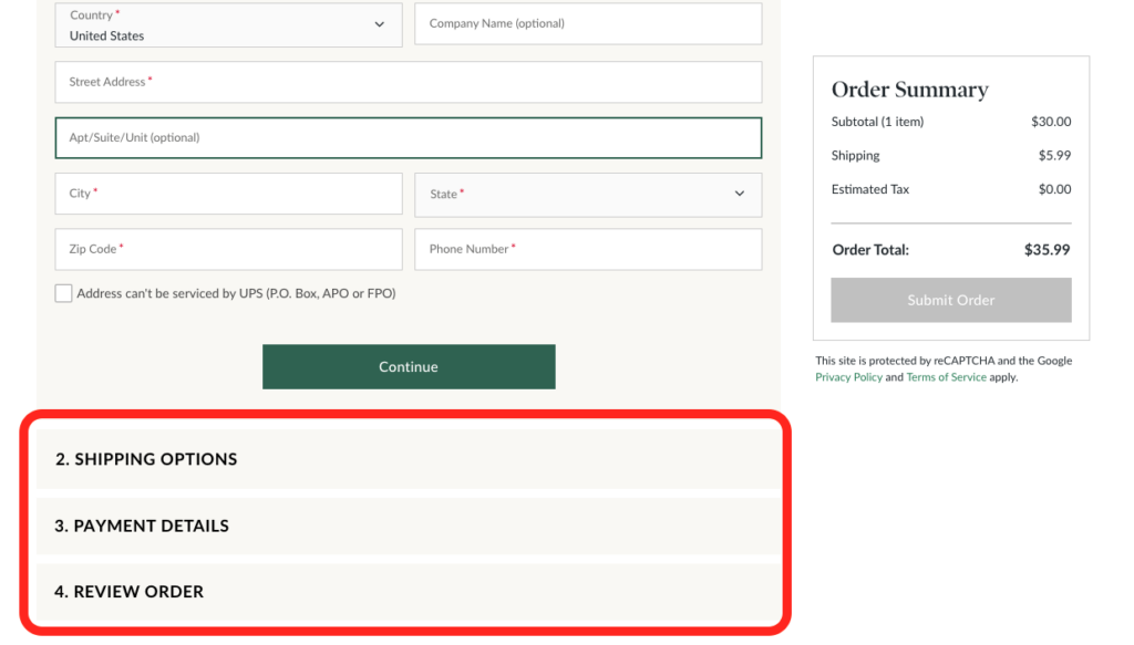
Barnes & Noble uses labeled tabs to show the next steps in the checkout. These bold labels leave nothing to the imagination and ease the customer into a predictable process.
Aim for Single-Page Checkout When Possible
If you can consolidate your checkout process into one page, you put all steps in view and promote transparency, clarity, ease, and speed.
That said, a multi-page checkout process can be useful for decluttering steps and preventing overwhelm during more complex processes. And, if a customer does abandon checkout, having a multi-page checkout can help you more accurately determine the issue.
In sum, more pages may test a customer’s patience when a single page is doable, but multiple pages can simplify complicated purchase processes.
Remove or Hide Unnecessary Form Fields
A fast ecommerce checkout flow excludes unnecessary information.
For example, you don’t always need to ask the customer for their phone number. And if they’re buying a digital product that doesn’t require shipping, you don’t need their address either.
The only contact information you need is the customer’s email address for sending order updates.
By only asking for an email, you save customers the hassle of providing personal details and signing up. Instead, an email is a good initial way to communicate with customers, allowing you to encourage them to sign up later and collect feedback.
Likewise, you can hide optional fields like the company name or second address line in a dropdown menu icon to accommodate all customers.
Optimize Mobile Checkout
Optimizing your checkout process for smaller screens like smartphones and tablets is necessary in today’s ecommerce landscape. As of July 2023, mobile sales comprised 60% of all ecommerce sales worldwide.
Smaller screens and touchscreen navigation call for additional UX practices, like:
- A single “full name” field instead of two fields for first and last name
- Hidden optional fields like a second address line, company name, or discount code
- Prominent CTA buttons that indicate tappability
- Removing hyperlinks and pop-ups in areas where customers can accidentally tap
- Automatic keyboard suggestions for email endings (e.g., “@gmail.com” or “@aol.com”)
Examples of Mobile Optimization
Allbirds’ desktop (first image) and mobile (second image) checkout pages show similar but nuanced experiences. In the desktop version, the order summary is visible by default. In the mobile version, the order summary is hidden in a dropdown, allowing users to see their order details anytime without cluttering the smaller screen.
Additionally, Apple Pay was added to the lineup of express checkout options in the mobile version. Adapting your payment options to your customers’ devices is convenient and intuitive, encouraging more sales.
Hide the Discount Code Field
Well-timed discounts can increase conversions, but a visibly empty discount code field can encourage a customer to become dissatisfied with the price you gave them and leave the checkout page to find a code. In the worst-case scenario, they don’t find a code and change their mind about purchasing.
Hide the discount field within a dropdown menu to serve customers who do and don’t have discount codes.
Display Form Validation and Error Alerts
Automatic red error messages help customers quickly fix mistakes like missing a field, providing a wrong address, or entering an invalid credit card number.
Green validation alerts confirming accurate information provide peace of mind and encourage customers to continue the checkout process.
Remember that both types of feedback should come immediately after the customer inputs (or forgets to input) the information.
Good form design also has alerts that are noticeable, preferably right under the relevant field.
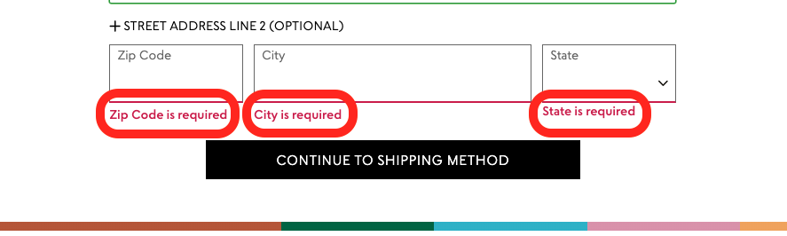
Example of Error Alerts
Uncommon Goods indicates clearly when the customer tries to continue to the next step without filling out a required field. The red text catches your attention and signals an error to make sure you collect accurate and necessary information.
Make It Easy to Review and Edit Information
If customers realize they entered the wrong address or payment method, they should be able to quickly and easily change their selections.
A clean order review page with editable fields gives the customer one final chance to correct errors. Better yet, allow customers to review and edit their selections as they go through the steps.
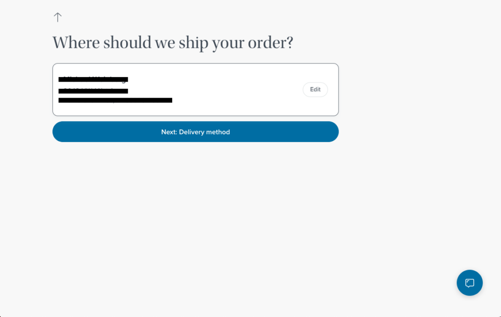
Example of Easy Review and Edits
Warby Parker’s checkout page is a continuous single page that lengthens after each step but preserves the customer’s previous selections on the screen. The scrollable UX design allows customers to quickly review and edit their choices without hitting a back button.
Copywriting Best Practices
Write Clear Form Fields
Checkout field labels should leave no room for misinterpretation or ambiguity. For example, an address field should have a label specifying whether it wants a shipping or billing address.
Fields should also show how to enter formatted information. For example, specify whether a credit card number needs spaces or in what order a birth date should be entered.
Explain the Parameters of Email and Text Communication
You only need customers’ email addresses to communicate order confirmations and updates, but you may also offer SMS messaging. For promotional emails and texts, you need to give the customer a choice to opt in.
The opt-in button should be labeled with a CTA and offer a brief yet enticing explanation of what the customer can expect from future emails and texts. The explanation prevents confusion, unpleasant surprises, and liability.
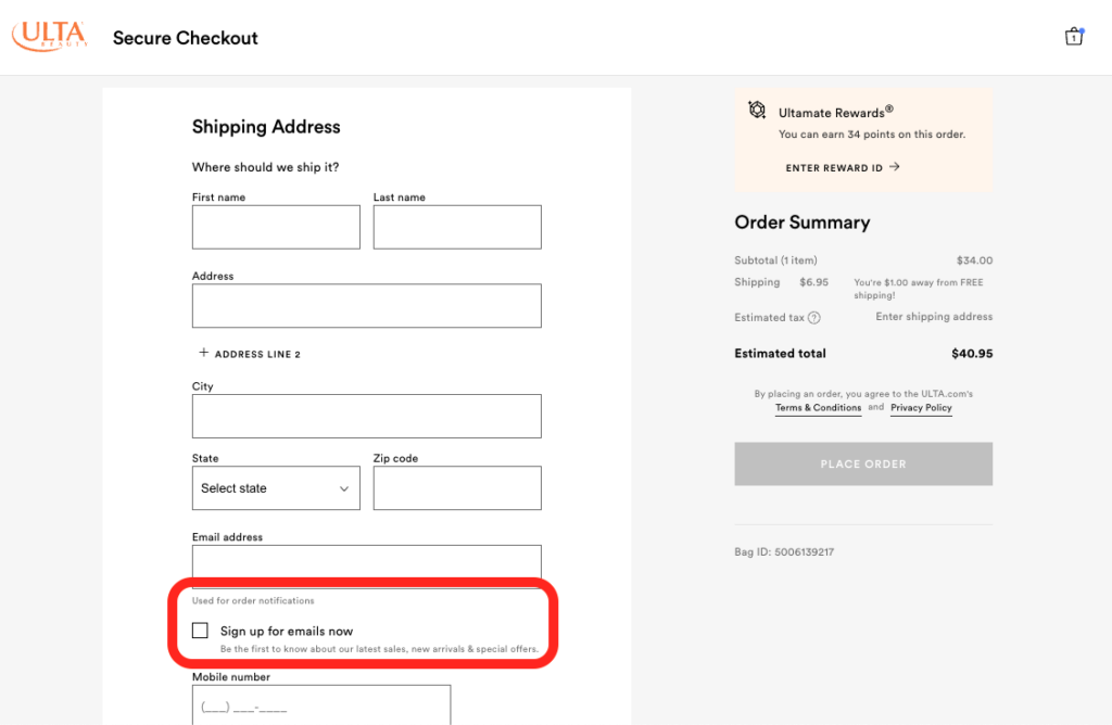
Example of an Email Sign-Up Description
Ulta’s checkout page features an optional checkbox labeled “Sign up for emails now,” encouraging customers to opt in. The description beneath the label says, “Be the first to know about our latest sales, new arrivals & special offers.” The short copy informs the customer about the exclusive benefit of receiving Ulta’s emails.
Call Out Sign-Ups and Extras Non-Invasively
Customers may have avoided creating an account, but you can nudge them toward savings, benefits, upsells, and cross-sells with subtle and enticing copy.
Focus on CTAs that emphasize benefits to the customer without getting in the way of the final purchase. Customers can appreciate the value of this type of messaging, even if they don’t complete the CTAs.
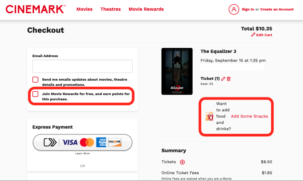
Example of Rewards Program Copy
Cinemark combines an easy opt-in to its rewards club with simple copy that gets the message across: earn points by signing up for free. Also, the casual copy “Add Some Snacks” is an effective way to cross-sell and encourage a higher AOV.
Transaction Best Practices
Add Multiple Payment Options
In 2023, according to the Baymard Institute, 11% of online consumers abandoned their carts because there weren’t enough payment methods.
With so many different ways to pay for products online today, you should have those options on your checkout page.
Ensure you offer the following types of payment:
- Credit and debit cards: As the most common payment method, cards are necessary. Go a step further and offer several credit card companies to reach even more customers.
- Digital wallets: These include PayPal, Apple Pay, Google Pay, and Venmo and rival card payments in popularity. They offer a much faster checkout experience, so you should include them.
- Buy now, pay later (BNPL): Providers like Affirm and Shopify’s Shop Pay take on the customer’s risk and allow them to pay for products in installments. Your checkout should include BNPL, especially if your products are high-ticket, your customers purchase several items together, or you want to reach a client base that uses credit cards less often.
- Gift cards and prepaid cards: Include these payment methods to help increase conversions. Consider selling gift cards for your store if you don’t already.
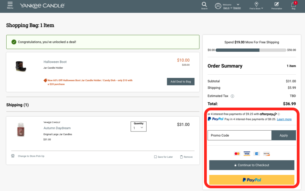
Example of Multiple Payment Options
Yankee Candle’s checkout page offers multiple payment options. The candle company offers two BNPL options (Afterpay and PayPal), four credit card options (MasterCard, Visa, American Express, and Discover), and a digital wallet option (PayPal). The wide array of options ensures the checkout experience is accessible to all customers.
Reveal and Lower Additional Costs
As we said earlier, nearly half of consumers abandon their carts because extra costs are too high. Don’t you hate it when your total is $15, but with shipping, tax, and convenience fees, it comes out to $30?
Best practice is to offer free shipping after a spending threshold if you can. Your customers will see the value in the lower end price, and it’s crucial to remaining competitive in the ecommerce space.
Obviously, your business circumstances may require you to charge certain fees no matter what. Sales tax, for example, is something customers can expect. Or maybe you can’t afford to ignore certain service fees.
To combat dismay at additional costs, be up front about the final total as soon as possible. The customer’s price expectations will never go beyond what you show them. This is also how you build trust.
Offer One-Click Checkout
One-click checkout is exactly how it sounds: Customers can complete the purchase with only one click or tap. With the customer’s permission, you can save their necessary information from a previous purchase, like email, shipping address, and credit card number.
The one-click experience streamlines the purchase process into a single button, going beyond single-page checkouts to encourage impulse buys and increase CLV.
Implement a one-click checkout experience if:
- You have a lot of returning customers.
- You sell less expensive items.
- You sell everyday consumable items.
Show a Detailed Order Summary
An order summary early in checkout is important because customers want to see that they added the right item and that it costs what they expected.
It’s also important to have a detailed final order summary that includes:
- The final itemized cost of each product
- The final total cost of the order
- A high-quality photo of each product
- Quantity, color, and type of each product
- The customer’s shipping address
- The customer’s payment method
Shipping and Fulfillment Best Practices
Use Autofill
Using system and browser autofills during checkout reduces friction for the customer and saves them time. It also ensures you receive accurate information to avoid extra shipping charges and delays.
Consider using autofill for any contact information they’ve provided, and give the option to select that the billing address is the same as the shipping address so they don’t have to type it again if it is.
Provide the Option to Track or Change an Order
After a customer purchases a physical product, they’ll want delivery updates. Provide a “track order” link in the order summary on the checkout page and in a confirmation email.
After the purchase, following up with email or SMS message updates helps build trust with the customer and enhances the likelihood of retention.
If a customer needs to switch the shipping address or no longer wants the product, they should also be able to make changes easily. On the confirmation page and email, provide an option like “make changes to my order” or connect them to customer support to make the changes.
Offer Details for All Fulfillment Options
Delivery and pick-up times, costs, services, and benefits can vary. In the heat of the checkout, a customer may not see the benefit of choosing a delayed versus expedited delivery option.
Especially if you don’t provide free shipping, you’ll want to provide clear details for the options you do offer. For example, customers may have to pay for shipping, but pick-up could be free. The more measures you take to accommodate the customer’s situation, the fonder they’ll grow of your brand.
For more information, check out our guide to Shipping for Ecommerce and our article How to Improve Your Customers’ Shipping Experience.
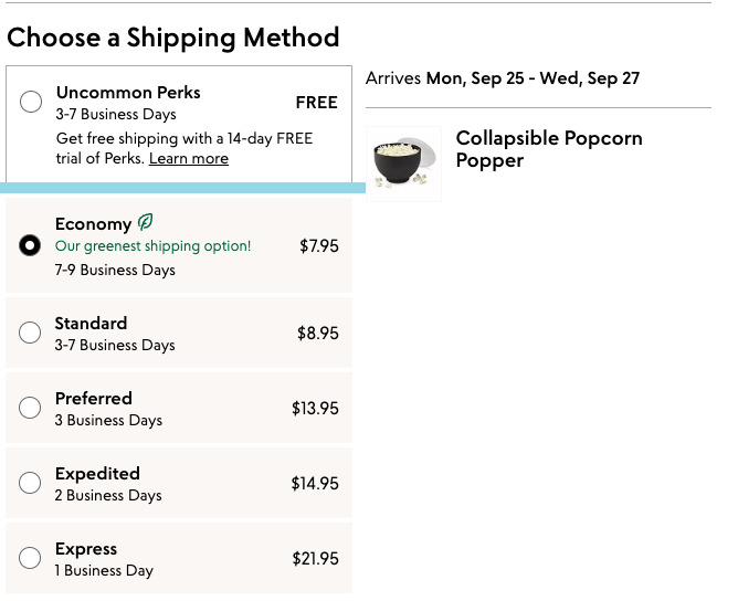
Example of Providing Shipping Option Details
Uncommon Goods offers flexible tiers for shipping, varying in cost and delivery time, and are transparent about all their options.
Specifying that the Economy option is the company’s “greenest shipping option” is also a good way to build brand trust by showing it cares about sustainability.
Purchase Confidence Best Practices
Convey a Free Returns Policy
A study found that 72% of consumers make purchase decisions based on a returns policy. Customers want to return their orders without having to pay a fee, which is now the norm.
Make it clear you offer free returns within a certain period, such as 15 or 30 days, to encourage sales.
Even if some customers return their orders, you’ll reduce risk and anxiety for the customer and build trust that can lead to future sales.
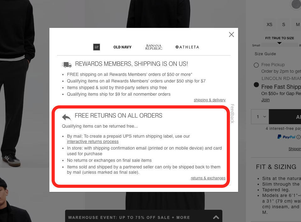
Example of Conveying Free Returns
Gap’s checkout page features a non-invasive information box offering details about free returns on all orders, with even more information at the bottom right link. Features like these make customers more confident about their purchase because the sale feels less risky.
Offer Guest Checkout
Some ecommerce retailers, like Target and Walmart, require account creation so they can collect data to make better-targeted marketing campaigns and increase CLV. However, your store may not have as much presence as the ecommerce giants to get away with requiring an account to purchase.
Consider letting customers purchase as a guest. Guest checkout requires only an email address and removes the barrier of inputting a ton of personal details for what should be a quick purchase.
Social login is another alternative to forced account creation without sacrificing data collection.
Social login (or sign-in) lets customers use one of their social media accounts, like Facebook, to make a purchase. This method allows you to collect personal details like full name, email, phone number, birthday, and more without putting customers through a lengthy sign-up process.
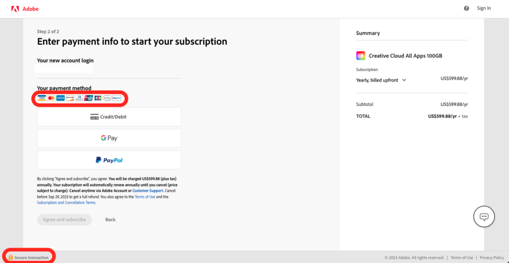
Convey Safety With Security Badges
Many online shoppers are hesitant to convert simply because they don’t know much about a product. Other customers may be wary about hitting the “pay now” button for expensive purchases or for smaller companies with low brand awareness.
Security badges for antivirus software, payment methods, and secure transactions help quell this purchase anxiety. The familiar icons and logos in a potentially unfamiliar online environment immediately encourage customers to lower their guard.
Example of Security Badges
Adobe isn’t a small company, but its checkout page still features a “secure transaction” badge at the bottom left and several payment method logos. These simple additions tell customers that the purchase they’re about to make is legitimate, trustworthy, and secure.
Customer Service Best Practices
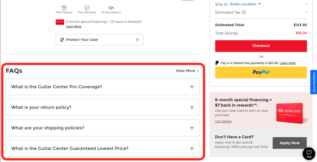
Display an FAQ Section Near Checkout
Good customer service doesn’t have to involve a conversation.
After collecting customer feedback for a while, you can compile a list of your customers’ most common concerns. Especially if your product or policies are complex, an FAQ section near the checkout page can help customers feel more confident about their decision.
It’s also much easier for customers to convert if they can find immediate answers to their questions as they check out. Otherwise, someone confused about how to return a product, for example, may not make the purchase to begin with.
Example of an FAQ Section in the Checkout
Guitar Center displays a list of FAQs tucked away in dropdowns. They answer questions about the company’s insurance, returns, shipping, and price policies that new customers may need an explanation for. They will appreciate getting quick answers to questions that might otherwise stop them from continuing the checkout process.
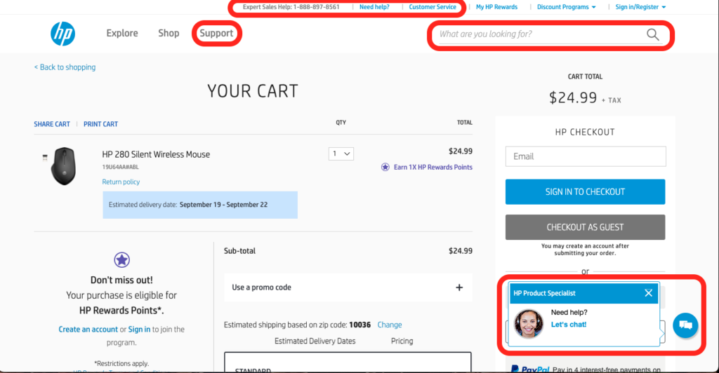
Make It Easy for Customers to Connect With Support
Sometimes, FAQs aren’t enough to help a customer’s specific situation. A good checkout page includes a customer service phone number or email at a subtle but expected location.
Enabling chat support is also an increasingly popular way to help customers. It’s best to keep an easily visible but non-invasive “chat” button in an expected location, like the bottom right of the page.
Easy-to-find customer support acts as a safety net for customers while making purchases. It also encourages them to speed up the process after realizing they can easily ask for help if they encounter a problem.
Example of Easy-to-Find Customer Support
HP links its sales helpline and customer service page in their main navigation menu and has a live chat function at the bottom of the page. Together, these features tell the customer that HP cares and wants to help them through the purchase.
Engage With Customers Right After Ecommerce Checkout
The post-purchase process is part of the checkout experience, and you should treat it as such. Send an email or text thanking the customer, providing order details, and offering support if they have any questions or concerns about their order.
You can also follow up with valuable product FAQs, tips, tutorials, and more to remind customers that your brand exists.
Engaging with customers after the purchase shows them you care and are responsive, leading to a smoother experience and higher CLV in the long run.
A Frictionless Checkout Process in Motion Stays in Motion
When customers are about to buy your awesome product, the checkout experience should be quick, easy, and even exciting. You’re good at what you do, but your product probably isn’t the only one of its kind on the market.
Just as competitive swimmers take advantage of every little opportunity to better glide through the water, you should make every effort to maintain a frictionless checkout process.
To increase conversion rates, take every opportunity you can to optimize the customer journey and get rid of anything that doesn’t benefit you and the customer.