
We know you hate waiting. Everyone does.
In a 2017 study, Google found that:
- 1-3 second load times increased bounce rates by 32%.
- 1-5 second load times increased bounce rates by 90%.
- 1-6 second load times increased bounce rates by 106%.
People don’t like waiting unless there’s a good reason to, and the longer the wait is, the less that reason stacks up. It’s why visibility of system status is one of Nielsen’s 10 usability heuristics for UI design. Visibility of system status means:
“The design should always keep users informed about what is going on, through appropriate feedback within a reasonable amount of time.”
And it’s where loading indicators come in. A good loading indicator:
- Lets users know the application is working.
- Makes waiting tolerable.
- Gives users something to look at.
The most common loading indicator in UI design is – you guessed it – the loading spinner.
But sometimes, you have to question common practice to push boundaries and discover innovative solutions. In this case, the loading spinner has flaws that designers have overlooked for far too long.
Spinner Design: Why Loading Spinners Suck
As far as loading animations go, the loading spinner is an unfortunate choice, particularly for waits longer than 10 seconds. Why?
Let’s start with a short story.
My first recollection of a loading spinner is from over a decade ago, long before I learned about user experience. It was in the school’s computer lab that I encountered the fateful, dreaded thing that my friends and I learned to call the Spinning Wheel of Death. It turns out it’s not an uncommon name for the macOS wait cursor.
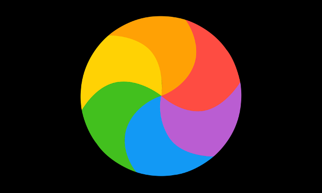
Image of macOS waiting cursor from How-To Geek.
Much like the Spinning Wheel of Death, loading spinners give no feedback – no sign of progress. They infinitely swirl, telling us nothing of the headway that an application has or hasn’t made. It’s frustrating to users and downright anger-inducing when you’re in a hurry.
You find yourself asking questions like:
- When is it going to finish loading?
- Is it almost done?
- Is it broken?
But your questions go unanswered, so you give up.
Worse yet, spinners slowdown time.
Have you ever been in the middle of a workout, desperate for a timer to end? Or impatient to escape class? In these instances, watching the clock and waiting aimlessly makes time crawl. Spinners do the same thing, minus the benefit of a countdown. They’re like waiting for food in a restaurant with a rumbling stomach; only, you don’t know if the chef got your order.
Sure, loading animations don’t actually control time, but our enjoyment of a task influences our perception of it. When we’re having a good time, the clock speeds up. When we hate waiting, it slows down.
And once again, the spinner encourages users to give up.
Moreover, you want your content to be valuable to users – to meet, if not exceed, their expectations. If, by chance, the page isn’t what they hoped, the added frustration of having stared at a spinner for too long furthers the damage.
To review, a loading spinner:
- Doesn’t give any sign of progress.
- Fails to answer a user’s questions.
- Makes the wait feel longer than it is.
- Doesn’t prepare user expectations.
Your Loading Animation Options
The best way to fix a user’s frustration with a loading spinner is to remove that frustration from the start. That means reducing the wait time until it’s nonexistent or using an alternative progress indicator.
Again, a good loading or progress indicator:
- Makes a user’s perception of time feel faster.
- Gives the sense that the application is making progress.
The two main types of progress indicators used in UX design are indeterminate progress indicators and determinate progress indicators. The determining factor is time.
The idea is that you use a typical loading spinner when you don’t know how long loading will take, and you use a determinate indicator, like a progress bar, when you do know. A determinate loading animation indicates how much longer a user has to wait with hints like percentage complete, minutes left or a bar that’s getting filled.
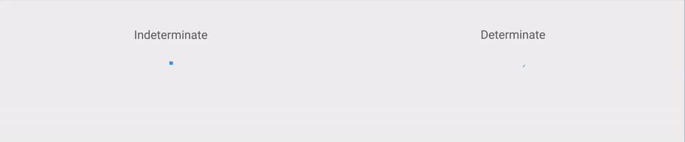
Indeterminate vs determinate progress indicator from Material Design.
The problem with this strategy is that you never know exactly how long something will take to load. You can make an educated guess, but that’s about it. It’s why many countdown indicators will count like this: 10 minutes left, 9 minutes left, 8 minutes left, 7 minutes left, 10 minutes left, 8 minutes left and so on. It will complete loading and hit 0 eventually, but not before it takes the user on a ride.
How to Make the Most of Loading Animations
We discuss an alternative solution to spinners and progress bars below. Still, if you’re determined to take a more traditional route or conducted UX research and found these were the preferred choice for your audience, there are some guidelines to follow.
First, only use a loading spinner for waits under 10 seconds. For delays over 10 seconds, create the illusion of progress with determinate indicators to keep users interested longer.
When you do design spinners or other loading animations:
- Be as creative and entertaining as possible
- Make it on-brand
- Provide as precise of a completion estimate as possible
- Explain why the user is waiting
– Please wait while we calculate your results.
– Please wait while we set things up for you.
– We’re gathering your data.
– 21 out of 30 files checked. - Don’t use an animation if the page will load in under one second.
Example loading screen gifs from Hacker Noon.
We could go on about making your loading animations better, but that’s not what this article is about. Because no matter how entertaining your loading animation is, it emphasizes the wait time and doesn’t provide a clear sense of progress.
That’s what skeleton screens are for.
Progressive Loading With Skeleton Screens
Research comparing spinners and skeleton screens revealed that skeleton screens are perceived as faster and leave users happier. So, what is this supposed hero?
As you know, loading spinners occupy a screen until the user interface is completely loaded, at which point it all appears at once.
Skeleton screens use a different tactic and reveal each part of the UI as loading progresses. It starts with a skeleton outline of the interface’s design and then proceeds to show elements as they complete loading. This strategy is called gradual progression, and details usually appear in the order of skeleton outline (also called placeholder UI), text and then images.
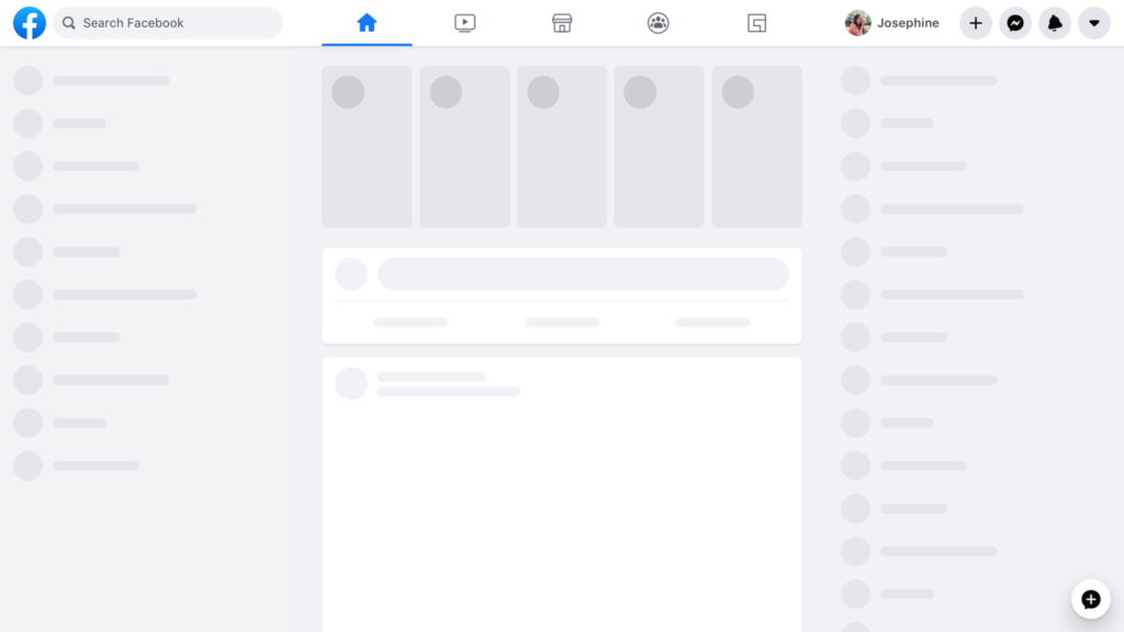
Sample Facebook skeleton screen from Facebook Engineering.
Used by big-name companies like LinkedIn, Instagram, Facebook and Google, skeleton screens offer a better loading screen experience by turning passive waiting into active waiting.
Passive waiting is when you’re just sitting there waiting with nothing to do, like when watching a spinner turn round and round and round. Active waiting is when you do something that feels like progress as you’re waiting. Skeleton loading encourages active waiting by giving the user new information to process each time the screen updates.
In this way, the skeleton screen takes the focus off of the amount of time you’re waiting and places it on the actual proof of progress happening before you, making the loading process feel faster. And as it reveals what has loaded and what is left, it allows the user to build accurate user interface expectations.
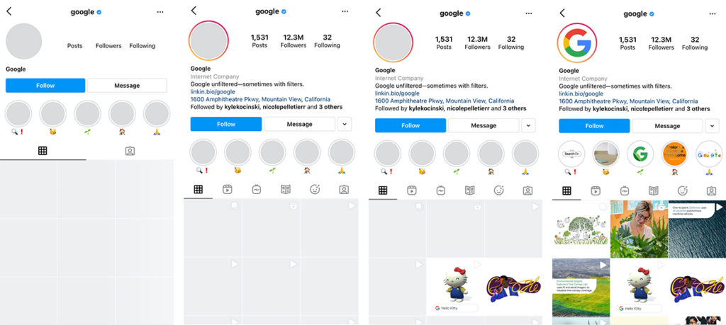
Instagram’s progressive loading in action.
When implementing a skeleton screen, ensure that your placeholder UI is an accurate representation of how the final UI will look. Otherwise, you create a gap between expectations and reality.
Some tools and websites, like Medium and Google Images, utilize progressive image loading to add another step in the progression. Progressive image loading is when you show the predominant color or blurred version of an image before it fully loads.
You can also design loading animations within skeleton screens to indicate loading. Facebook, for instance, has the grayed-out text bars on its skeleton screen execute their own loading motion as the page loads.
Users perceive screens with left-to-right loading motions and slow and steady loading motions to be faster.
Skeleton Screen Concerns
There are, as always, critics – the greatest concern being that gray blocks are a dull and unattractive solution for users who are expecting to see great content.
To some degree, this concern misses the point of the skeleton screen: to hint at the great content that is rapidly on its way. No user expects or wants a loading screen at all, but skeleton screens provide the comfort of knowing that an interface is working and will be available in a matter of seconds.
Of course, gray blocks do become irritating when there’s too long of a waiting period between each progression phase. The longer the wait time, the worse it gets. This is the case with all loading indicators because, as we established in the beginning, no one likes to wait for long.
With skeleton screens, it helps to implement multiple progression phases to keep activating the user’s focus. There are poorly designed skeleton screens out there that go from gray placeholder UI to everything all at once, which defeats the purpose. Effective progressive loading shows content as soon as it’s ready to keep users informed, interested and hopeful.
If the wait time is a tad longer than ideal, you might consider using a spinner for a couple of seconds before revealing the placeholder UI and loading in your content. Doing so can buy you a small amount of time as long as the placeholder UI comes in to show substantial progress.
If your loading time is too long, reducing your wait time is always the best option and should be your priority. There are many reasons your website might be slow.
Test It: Good UX Starts With the User
User experience starts with the user, and no answer is right for everyone, even when it is for most. It’s why providing a good user experience begins with testing your ideas to establish what works best for your audience.
Back in the day, offering the best spinner design was the best you could do.
Now, well-designed progressive loading is an alternative worth considering. It speeds up perceived waiting times, provides a sense of progress, implies what is left to load and advises user expectations.
But that doesn’t mean it’s time to stop questioning best practices. The days of using long, uninformative loading animations may be behind us, but one day, something will overcome the limitations of skeleton screens the same way they have for loading spinners.
Until then, if you’d like to learn more about how to improve your UX, reach out. We love to talk strategy.