Dark patterns is a term first coined by Harry Brignull in 2010. They are a facet of user interface design in which design is developed to nudge users towards an action they probably wouldn’t have taken otherwise, towards actions that benefit the ones doing the nudging.
Forms of this psychological manipulation could often be interpreted as bad UX design but the reality is much more sinister – these dark patterns are there by design, and they’re not going anywhere.
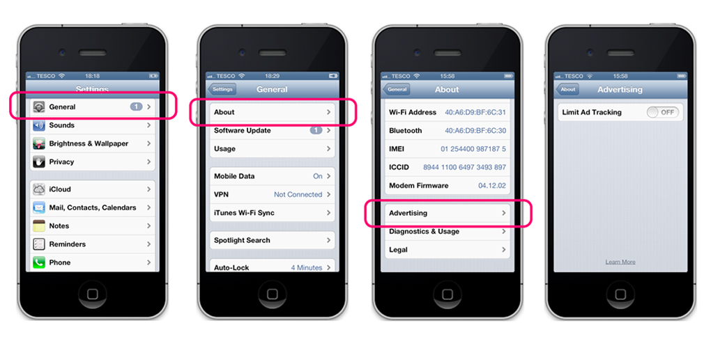
This could be a website trying to trick you with a double negative. Like this example from 2013, in which after finding where to opt-out of ad tracking on the iPhone, the toggle option itself is designed to confuse you.

“Ad Tracking – Off” means something different to “Limit Ad Tracking – Off.” In this instance, if the switch is off, ad tracking is actually on – and that’s how they want it. Brignull argues that this is a subversion of the 10 Usability Heuristics for Interface Design, as outlined by Jakob Nielsen in 1995. In this instance;:
- “Instead of showing key status information, hide it. Do this with unclear labels, obtuse navigation, and untimely messages.”
- “Take advantage of your users’ natural capacity to make mistakes to have them accidentally complete actions that are beneficial to your objective.”
So when you’re frustrated that you’ve accidentally taken an action you didn’t want to take, reverse engineer the process that led you there. Or study this glossary of dark (or deceptive) patterns and equip yourself with some foresight. Because once you start looking for them, you’ll realize they’re everywhere.
Types of Dark Patterns
Forced Continuity – When your free trial or introductory offer ends and you’re auto-enrolled into the paid version without further acknowledgement.
Friend Spam – When a company like LinkedIn asked you to “grow your network” but used your “permission” to send sign-up emails to your contacts on your behalf telling them to sign up too.
Privacy Zuckering – Sharing more personal information than you intended to? Looking at you, Mark!
Roach Motel – Easy to get in, an absolute labyrinth to get out of. Have you ever tried to cancel your Prime subscription?
Amazon is massively guilty of dark pattern practices. Some design features are useful to users as well as benefiting the website. For example products related to items in your cart might prompt you to remember something else you intended to buy, convenient for you and an extra sale for Amazon. But some of these tricks cross the line.
It had been hoped that UI designers would self-regulate as the skill and the market matured but things have only gotten worse in the decade since the name dark patterns was coined. The nefarious ways in which companies are able to get users to spend more money, or trick you into sharing personal data are getting the attention of lawmakers – won’t somebody please think of the children?
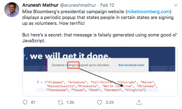
And while it’s funny to see how some of these patterns have been technically implemented when designers have been caught.

Not just the design that uses clever psychological trickery to nudge actions, copywriters are guilty too. Confirmshaming is the act of guilting a user into opting in to something; to shame the user into compliance. Most commonly, you will see these on pop-ups when you want to opt-out of something – they will apply a negative: “No thanks, I’m fine with losing customers!”

The examples of these are endless, you will probably find one within a minute of going through the promotions tab on your email – or browse this Tumblr page.
The biggest problem with dark patterns now is that it is very easy to run different versions of copy or design on a website for testing. Companies can get insights over the pressure points that are most effective and then exploit the tactics that have the highest return. Like some kind of “Black Mirror” episode, we’re all participants in this psychological experiment.
What can you do to fight back against dark patterns?
The first step is just to be aware of them. Follow @darkpatterns on Twitter for more examples of dark patterns out in the wild.
As a user, it’s important you recognize the tactics companies might use and to think critically about your actions online. Call out companies that use abusive dark patterns, maybe they’ll make into the Hall of Shame. As a designer, we encourage you not to use them; win customers with better products and better design, and create a better, inclusive internet.
At Boldist, we believe that great UX and UI design will give deliver your customers a great experience while simultaneously fulfilling your business objectives.

