Imagine you’re building a new website for your online store. You go into a page builder like WordPress and start adding sections to pages, deciding that the navigation bar should be centered or that your About clip should come first.
Or maybe you already have a website, and you’ve decided it could look better, so you start relocating images, text and CTAs.
Regardless, mistakes have already been made: in both instances, there is no strategy or user flow present. Design is casually chosen, splattered like an authentic Jackson Pollock painting.
And a fan of Pollock or not, his paintings never had to navigate a lead from one stage of the funnel to the next.
In the new age of online shopping, having an ecommerce website is critical – an app, potentially beneficial.
But having a beautiful website isn’t enough in the same way attracting loads of traffic is a waste unless it converts (i.e., buys your products). You need a website designed to guide your leads down the path to conversion.
A well-designed website doesn’t start with choosing your favorite font and animation. It starts with mapping your user flows.
What Is a User Flow Diagram?
User flow diagrams – also called user flow charts, task flow diagrams and user interface flow diagrams – showcase the path a user takes through your website or app to accomplish a goal or task. By illustrating the steps a user takes to flow from one page to the next until they complete their task (like buying a product), you gain an understanding of how to encourage task completion.
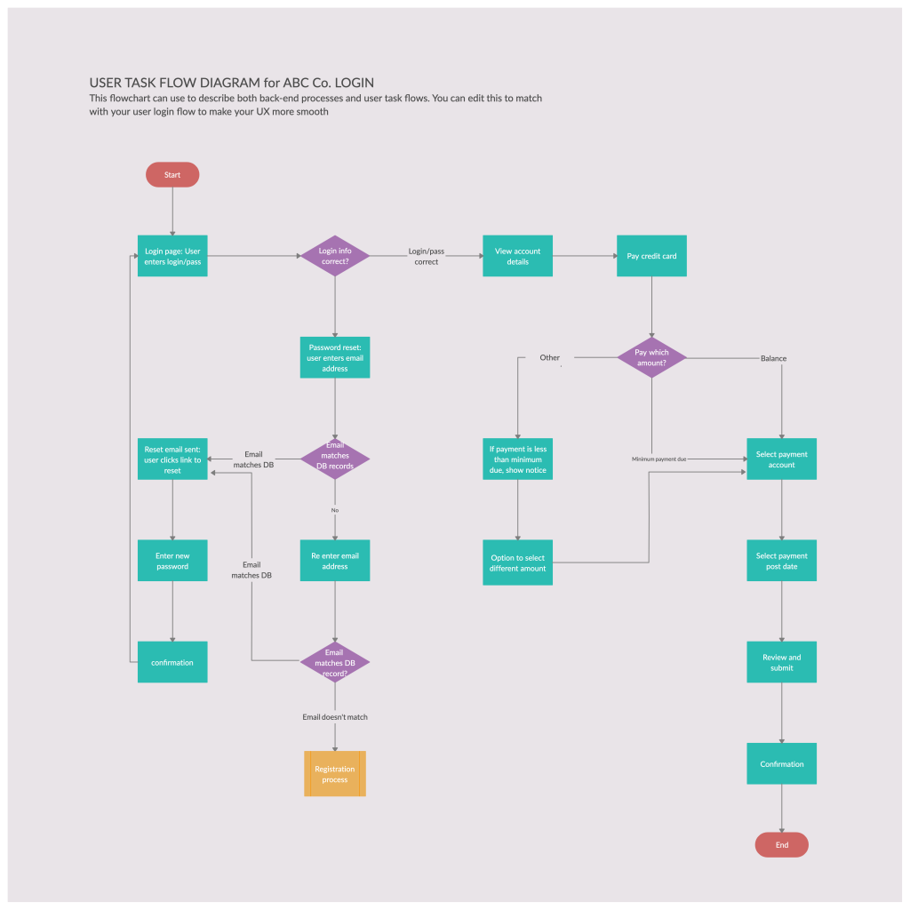
Sample user flow diagram from UX Collective.
The Role of User Flows in UX Design
User experience design (UX design) is about creating designs that are user-centered. By putting your users, aka potential customers, at the center of your design choices, you enhance their experience and increase the chances of them navigating to the end of the sale.
User flows reveal how users interact with your product design, taking into account the user actions and product functionality required to create a conversion.
Create a user flow diagram before beginning the design process to inform your website needs. Strategists, designers and web developers use UX flows to spot product deficiencies and understand the scope of a project, including the number of pages, components for each and information architecture of it all.
You can also create user flows post website development to spot areas for simplification and improvement.
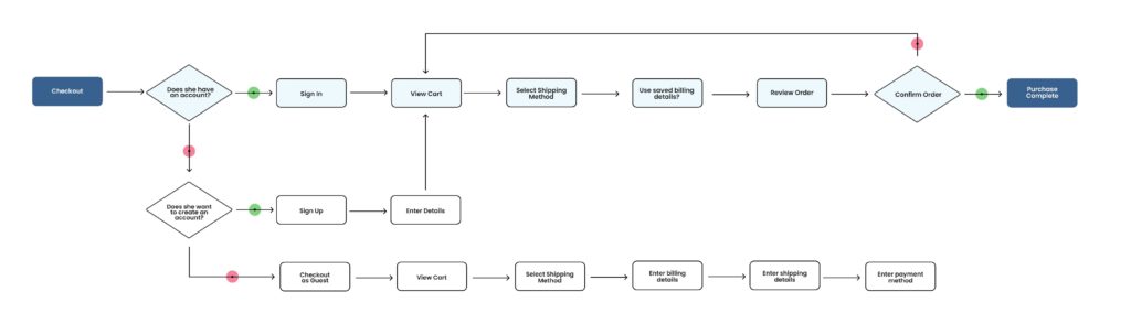
 Sample user flow diagram from Creately.
High-Level vs Detailed User Flows
High-level user flows are fast and brief, created to provide a quick overview of an idea or process.
Detailed user flows, or task flows, are of more use, detailing all the steps and decisions involved in completing a task. Detailed flow diagrams are what you want to create to inform the design and content for your ecommerce website.
Some differentiate user flows from task flows in that user flows emphasize that a task may be completed differently by users based on persona and entry point.
User Flows vs User Journeys
User flows are different from user journey maps that outline a user’s end-to-end experience with a product. Where flows are purely action-based, user journeys take into account factors like user emotions.
User journey maps and customer journey maps are sometimes used interchangeably, but this only works when the user and customer are the same person, which isn’t always the case. For example, an employer (the customer) could purchase an online tool for their employees (the users) to use.
How to Build User Flow Diagrams
1. Decide on the Diagram’s Purpose
What your user flow diagram includes will depend on your goal and the task you’re tracking. Limit the number of goals or tasks per diagram; charting only one at a time is best. Looking at more than one can overcomplicate and crowd the diagram, making it less effective.
Give the user flow a clear title based on its purpose for future reference.
2. Understand Your Typical User
An understanding of your users will help inform the task flow navigation that works best and the content to include on each page.
Conduct user research to gather your users’:
- Goals
- Motivations
- Desired features
- Level of experience/knowledge
- Barriers
These factors can change for different audience segments and stages along the purchasing journey, but you will use them to determine what goes on each web page, how to design each page and where to link to.
User and business goals should align so that you can design ecommerce website flows that meet both.
Studying your competition’s flows can also provide insight.
3. Create a Task Flow Key
There are no hard rules for what your task flow diagram should look like as long as you’re consistent and provide a key for colors and shapes used so that others can understand it.
Common user flow symbols include:
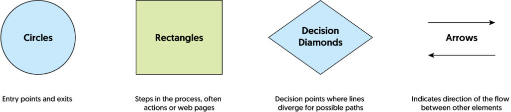
Other shapes sometimes used include triangles, slanted parallelograms and dashed shapes (instead of solid outlines). You can get as specific as you want, switching up shapes for additional items like system tasks, input elements, or selections/clicks.
Any colors used should contribute to the meaning and readability of your user flow chart. Consider how color can help group items, identify elements and reveal patterns.
Other Types of User Flow Charts
Since user flow charts are unique to your website, not all follow the common practice of using shapes and color.
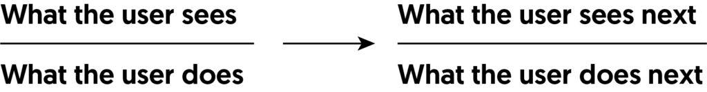
Another style of user flow is modeled after the state diagrams used in computer science. State diagrams vary in appearance, but you can write them as a series of fractions with arrows guiding the ecommerce process flow. The fractions include what the user sees above the fraction line and what the user does below it, like so:
There are also user flows modeled after site maps. In addition to actions taken, they present each web page involved in the user flow with a list of all sections and subsections on those pages. Then, arrows or lines show which page sections and CTAs lead users to the next step in the flow.
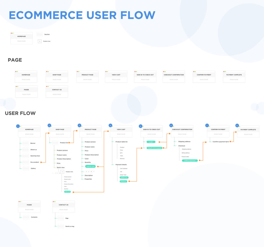
Sample user flow from Salinthip Kaewkerd on Behance.
4. Outline Your User Flow Diagram
With your format decided, you can start mapping out your task flows. Begin with the entry point chosen for your particular diagram, and list all steps between the entry point and task completion.
Entry points can be any source that leads a user to your website, including advertisements, social media, organic search results, external links, email campaigns and more. Apps tend to have fewer entry points than websites.
The steps that follow (the meat of the user interface flow diagram) will depend on the task you’ve chosen to map. They may include items like login and signup forms, product browsing, checkout processes or onboarding. Consider how the user gets to each page, all actions they may take on it and where they go from that page to progress towards their goal.
The final step in your user flow shouldn’t be the user action that completes the task but the functionality that confirms completion for the user.
If you’re upgrading a current ecommerce website, you can use Google Analytics Behavior Flow reports for insight on where your users come from, how they navigate your website and where they exit.
As you map your user flow, you’ll notice that there are multiple paths a user can take to complete one task. Branches or nodes will break off at these points to continue mapping the primary pathways.
When creating flow diagrams, you can increase readability by limiting the number of directions they move in. If you end up with arrows pointing every which way, your diagram starts looking more like a maze. There are many user flow tools available for creating functional diagrams.
5. Cut Down Your Flows
Once you create your user flow diagram, it’s time to whip out your shears. This step involves three significant edits:
- Removing information that’s unessential to visualizing the flow
- Moving details outside of pure user navigation to a journey map
- Identifying steps that are redundant or unnecessary
This last step is less for visualizing navigational flow and more for the user whose experience you’re improving. The more decisions and actions a user has to take to complete a task, the less likely they are to do so. Simplify your user flow as much as you can to increase the chances of conversion.
6. Label With Intention
Label all elements of your user flow diagram with clarity. It should be clear what each shape, page, section or action is referring to. Avoid using shorthand if it detracts from the meaning. When finished, have a few coworkers review your user flows to see if they can interpret them.
Optimize Your User Flows With Data
When creating a new website or testing new designs or content, consider examining real-life user flows and comparing them to your expectations as portrayed in your flow diagram. If discrepancies arise, you can use them to correct your flow diagram or edit the user interface itself to guide users the way you planned. Several UX research methods test user flows, including usability testing, task analysis and tree testing.
You can also use data from Google Analytics or research to see where you can optimize your user flow to increase sales. When building ecommerce websites, user flows tie into the ecommerce sales funnel. It’s natural for users to drop off the further down the funnel they go (hence the funnel shape), but drastic drop-off points indicate areas for improvement.
And often, improvements mean optimizing your user flow, whether by making navigation more natural, editing design or adding directional copy.
Drop-offs in flow can also result from business choices: an increase in bounce rates after potential buyers see the cost of shipping indicates that high shipping rates are likely the problem.
Analyze the steps surrounding bounce rates, and hypothesize what the problem (and solution) may be. A/B test your solutions until drop-offs decrease and more users flow to the next step.
Differentiating Your Ecommerce Website Flow
Ecommerce flowcharts tend to follow a similar pattern: discover a page externally, enter the page, look at products, add products to cart, checkout, receive confirmation.
While these are all steps involved in ecommerce by nature, it’s worth considering your unique value proposition and audience when designing user flows.
Can you offer more? Can your users benefit from additional features?
Some ecommerce stores mix up user journeys and task flows by including personalization quizzes or try-on features. Sephora’s Virtual Artist, for instance, allows users to simulate what makeup would look like on them before purchasing from home.
Another place to differentiate in ecommerce that is often forgotten about when designing user flows is post-purchase. Confirming a customer purchase is never the end of the customer journey. Now they have to track their package, anxiously await its arrival, excitedly unbox it and potentially return it. It’s worth considering how you might improve user experience with shipping, thank you pages and upselling.
When creating flows for ecommerce websites and apps, keep in mind all stages of the ecommerce funnel:
- Consideration
- Evaluation
- Purchase
- Post-purchase
Drive Sales With Efficient UX Flows
User experience is more than pretty design users enjoy looking at. It’s designing information architecture and content that guides leads through the ecommerce journey towards conversion.
It’s about building a website or application that a user can navigate with ease, moving from one stage to the next, finding the product they’re looking for and clicking the right CTA when the time comes.
Cramming too many steps between their point of entry and the point of sale means asking them to do more work; too few steps may not be enough to settle their hesitations, which means asking them to take a greater risk. No one likes work or risk when buying online.
Mapping an efficient user flow for each of the tasks on your website is an effective way to spot consumer friction points, so you can design a digital product that provides a greater user experience and, consequently, drives sales.