In our modern world, our lives revolve around a stream of breaking news alerts, status updates, tweets, memes, images, and videos inundating our timelines. And whether we care to admit it or not, we have forgotten what life was like before social media. Social media has shaped our public discourse, from allowing us to connect with loved ones to reacting to happenings around the world.
But for the 2.2 billion people worldwide who suffer from vision impairment or blindness, some aspects of social media are still inaccessible, despite the efforts of social media giants. Admittedly, our own agency, which has placed a focus on creating accessible websites has not made it a priority to make social media accessible as part of our marketing strategy. Today, we are checking our privilege and identifying our blind spots in an effort to continue to grow in our craft and ensure everyone is included.
How Does A Blind Person Use A SmartPhone?
Despite the iPhone being accessible to the blind and visually impaired since the launch of the iPhone 3GS over a decade ago, many people still do not understand how a blind person could use a phone without buttons. The iPhone, and other Apple products, use a screen reader program called VoiceOver which is found in the phone’s settings. Android smartphones use a program called TalkBack.
Screen readers are assistive technology that attempts to interpret what is being displayed on the screen. In the case of an iPhone, users can touch or drag their finger around the screen, and VoiceOver will read or describe whatever the user has selected, from reading sentences to describing images and emojis. The phone even has the capability of assigning commands from a gesture. But, while testing this feature out on our own phones, we realized that although the iPhone has the capability of “reading” an image, if the person who posted the image originally is not following best practices for social media accessibility the screen reader tends to miss a lot.
Include Alt-Text.
Screen readers describe the content, images, and charts to the blind and visually impaired using alternative text, or alt-text for short. When developing a social media strategy, marketers should keep descriptive alt-text in mind when drafting captions for future social media posts.
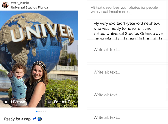
Avoid saying, “This is a picture of…” They know. Because the screen reader will automatically recognize an image, you can assume the user is aware as well. An alt-text caption of a picture, for example, could read, “My very excited 1-year-old nephew, who was ready to have fun, and I visited Universal Studios Orlando over the weekend and posed in front of the globe outside of the park entrance!”

Be descriptive and don’t be afraid of using humor. Some blind and visually impaired social media users lost their vision gradually and are familiar with color, so don’t be afraid to mention it! Your captions are being read by a robot, but don’t feel like you have to write like one. Most importantly, don’t overthink your caption!
Chill out with the emojis. Screen readers read everything, so avoid using excessive emojis on your captions or alt-text. No one wants to hear, “face with tears of joy,” over and over again!
Transcribe text. Screen readers won’t be able to read images such as a picture of a historical marker, plaque, or chart. Transcribe or summarize what the image is showing.
How-To Add Alt-Text.
Automatic alt-text does not always work and will use general terms such as “food” as an automatic descriptor when you could be describing dishes such as a succulent roasted pig, crispy, and round Brussels sprouts in a bowl, or hearty, warm chicken soup.
The character count for alt-text varies by the social network. We’ve linked to each social network’s how-to below, but it is easy to figure out once you upload an image and choose edit or advanced editing options.
Write your hashtags in camel case.
Make your hashtags accessible by capitalizing the first letter of each word. This format is known as camel case and allows screen readers to read the words individually rather than as a long, jumbled word. #YourHashtagsShouldLookLikeThis
Color contrast.
Color contrast is important for colorblind social media users. According to W3C, the contrast between text color and background should be 4.5 to 1. Problematic color combinations include red and green, green and brown, green and blue, blue and gray, blue and purple, green and gray, and green and black.
These tactics are only a small glimpse at how social media marketing can be inclusive and accessible to the blind and visually impaired. And while social media giants like Facebook have opened many doors to these users, they continue to encounter many glitches and problems with the programming and feel as if there isn’t enough manpower dedicated to addressing these issues.
It is time to take things into our own hands, just like the many groups making memes accessible to the blind and visually impaired, and include them in our marketing strategies and world.

