If done right, your company logo will become the face of your brand. A successful logo will be immediately recognizable, and at Boldist, we believe less is more, allowing for faster load times and clarity on smaller screens. Let us help you tone down the make-up and accent your finer features.
We understand that it’s not always the case that friendly people have warm, welcoming eyes or that predatory people have bulging eyes and ferocious teeth. While this would make the destiny of relationships a lot easier to predict, a human’s face just doesn’t work this way. Luckily, logos are not humans.
Just How Important Are Faces?
Close your eyes and picture your best friend. You identify an image of your friend with an image of their face, right? We assume there’s a whole lot more to your best friend, perhaps the ability to listen, say the right thing, make a good joke, or even convince people to chug a gallon of almond milk in under five minutes. But we don’t picture these qualities. We can’t. We picture the concrete, the consistent. Images. Faces. Call us superficial, but we’re only human (well, most of us, anyway).
Now, close your eyes and picture Nike. If you don’t see the iconic Swoosh logo, keep it to yourself – you’re ruining the experiment. The Swoosh has been so effective through the years, Nike has the rare ability to spell their name without using letters. That’s the power of a consistent and effective logo. There’s a reason Nike hasn’t changed their trusty logo since its creation in 1971. It works.
How would you feel tomorrow if your best-friend of ten-plus years walked into your house with a misplaced nose, two different shades of eyes, and an unflattering new wig?
Well, that’s how we feel when we look at some of these logo redesign mishaps.
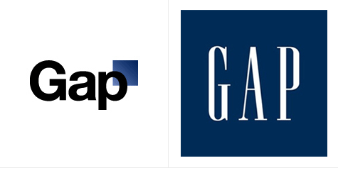
Gap Inc. Logo Redesign

Gap suffered a heavy backlash in 2010 after changing its logo of twenty years. Gap took things outside of the box. Literally. They switched to the Helvetica font, shrunk the blue square, and moved it to the upper right corner of the brand name. After a couple of days and hundreds of critics, Gap decided to ditch the new logo and return to what was working. But this didn’t come without loss. Gap had already spent one million dollars promoting its new logo and brand image. The word “oops” comes to mind.
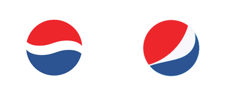
PepsiCo. Logo Redesign

Pepsi has kept the same basic wave in its logo since the early 1930s. In 2008, Pepsi distorted the wave and changed to a lighter typeface in an effort to shift toward a cleaner, stronger brand image. The nonsensical logo redesign was a head-scratching moment for many, especially once it was revealed that Pepsi paid $1 million dollars for the new logo which looked a lot like the original logo. Around here, we call that “trying too hard.” Why did they mess with it? To us, the old logo looks stronger and more appealing.
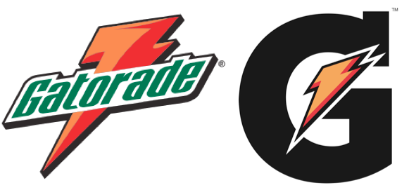
The Gatorade Company Logo Redesign

A few years ago, Gatorade dropped the latter seven letters of its name and quickly discovered not many people had ever heard of a beverage company called “G.” The new logo and packaging provided Gatorade an unwelcome sales decrease of 13.7% in the first quarter, and its market share decreased by 6.3%. Gatorade stood by its new logo and the culture has now settled into it, but the relaunch took a while to be embraced by customers.
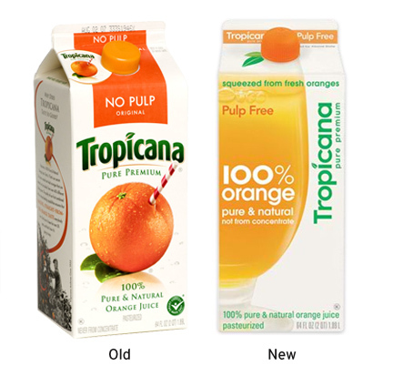
Tropicana Package and Logo Redesign

What happened to the iconic orange with a straw poked in it? That was awesome. After the package and logo redesign, the Tropicana Pure Premium line sales plummeted 20% costing the brand tens of millions of dollars. Hilariously enough, the agency behind the Pepsi logo redesign was behind this one, as Tropicana is owned by the beverage company. And that’s not all. Tropicana’s competitors benefited from the misstep, most notably Minute Maid, Florida’s Natural, and Tree Ripe. Varieties within each of these brands posted double-digit unit sales increases during the period.
Moral of the Story
Many people don’t like change. Especially consumers. Consumers buy things they trust. When something changes with it, especially its physical appearance, they grow suspicious. So here’s the rule. Use the diaper method. If it stinks, change it. If it doesn’t, leave it alone. And if you’re not sure, hire a good branding agency to take care of the mess.


