PPC snags a decent percentage of the average ecommerce marketing budget because it’s great at increasing traffic.
According to research conducted by WordStream on over a thousand Google Ads accounts, about 65% of people click on a PPC ad when they’re looking to buy (as determined by the commercial intent of their search).
But traffic isn’t all you’re looking for, and PPC converts best when your landing pages can close the sale.
Many ecommerce businesses and marketers put all of their attention into getting users to a website and forget to convert them once they arrive.
Implement the PPC landing page best practices in this article to increase page conversions and get the most out of your ad spend.
What are PPC landing pages?
A PPC landing page is the page a potential customer “lands” on when they select your pay-per-click ad. This customized page is optimized to convert buyers interested in the product your ad is promoting. You should use landing pages to raise conversion rates and minimize your cost-per-click on paid search campaigns.
Not knowing better, many businesses direct paid clicks to their homepage instead of a campaign-specific landing page. Many ecommerce businesses understandably make a similar mistake with product detail pages.
Product Pages Won’t Do: Why Landing Pages Are Key for PPC
When someone clicks your pay-per-click ad, they have three options:
- Leave the page
- Become distracted
- Continue down the sales funnel
Landing pages are important for PPC because they are created with one goal in mind: pushing consumers down the purchase funnel that began with their search query and your ad.
Other web pages aren’t optimized to convert the same way good landing pages are, and they don’t complete the experience initiated by a paid search campaign.
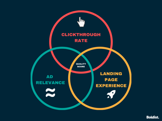
A dedicated landing page also increases your Quality Score, which is how Google Ads judges your ad quality compared to others. A higher score earns better ad positions and lower costs per click, and one factor Google uses to create your score is your landing page experience.
According to Google, these three factors determine Quality Scores:
- Landing page experience: How relevant and useful your landing page is to users.
- Clickthrough rate: The chance that users will click your ad.
- Ad relevance: How well your ad matches a user’s search intent.
In the same way that a good landing page will improve your score and your campaign’s effectiveness, a bad PPC landing page will do the opposite.
Google’s job is to provide quality content and solutions to its users, and if your landing page isn’t campaign-specific enough to engage and succeed, your ad will show less often.
Google evaluates your landing page experience through humans and automated systems, but you can check your Quality Score through your Ads account by following Google’s directions here.
Why Homepages Can’t Replace PPC Landing Pages
Homepages don’t work as landing pages because they aren’t specific enough to the ad, the audience segment you’re targeting, and their level of awareness. A homepage also leads to the rest of your website, and a PPC landing page should only direct visitors to its call to action.
Imagine that Jane Doe’s looking for the perfect centerpiece before the holidays ramp up. She turns to a trusty source (Google) and looks up “seasonal table centerpieces.” She sees the perfect ad, promising everything she wants, and clicks the link.
But alas, Jane is taken to a homepage.
She sees all kinds of products: candles, lamps, rugs. In addition to all the navigational options open to her, the discount the ad promised is nowhere to be seen. She has too many options, and it’s much easier to hit the back button and choose another link than to search for what she was promised.
Your homepage also targets everyone on your website—something a targeted PPC ad shouldn’t do. If you craft the perfect ad to speak to the needs of a specific audience segment (as is best practice), then your landing page should continue that experience.
Why Product Pages Can’t Replace Ecommerce Landing Pages
A product page is better than a homepage but still not an optimal PPC landing page. They, too, are not campaign-specific enough and can lead users away from your goal. People who land on a product detail page are less likely to buy and 72% more likely to bounce than those who land on a landing page.
A product page cuts out the courting process. A good landing page is designed and written to engage the audience and prevent buyers from leaving.
What Should Be On a Landing Page?
A great PPC landing page is uniquely adapted to the campaign at hand but will usually include the following elements:
- An attention-grabbing or benefit-oriented headline
- A supportive subheadline
- High-quality images and video that cover every angle
- Brief copy that speaks to the buyer
- Standout product benefits
- Testimonials and trust symbols
- A clear, specific call to action
- The following PPC landing page best practices
How to Build an Effective PPC Landing Page: 25 Best Practices
1. Make It Fast
Your site speed matters. When was the last time you felt good waiting for anything online?
For most of us, we feel frustration the second a loading screen appears, even if only a little at first.
Slow loading speeds mean high bounce rates and less time spent on your pages, which is why landing page tip #1 is to make it fast.
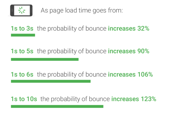
Google’s own research shows that pages that take three seconds to load have a 32% higher bounce rate than pages that only take one second.
And the people who bounce? They aren’t buying.
Where to start:
Visit Google’s PageSpeed Insights to test the loading speed of your PPC landing pages and see suggestions on how to speed up.
2. Let the Ad Be Your Guide
The experience a user has when they see your ad and after they click it should be seamless. That is, your landing page should make sense in context by being as relevant to the ad as possible.
Relevance is one of the traits Google considers when evaluating your campaign’s Quality Score.
You also want your “pre-” and “post-” click experiences to make sense to your audience. If they select an ad for a reason that vanishes or isn’t readily apparent on the landing page, they will leave confused.
The best way to achieve this is to keep your messaging consistent. Let the ad be your guide.
Where to start:
- Consider using similar headlines on the ad and landing page.
- Focus on a unique selling point (USP).
- Maintain consistency within any imagery used (similar feel and colors).
- Make sure all points mentioned in the ad are readily visible on the landing page.
3. Use One PPC Landing Page Per Ad
One way to improve landing page conversion rate is to collect insightful campaign data and optimize your strategy without making guesses. Using only one PPC landing page per ad makes collecting and interpreting data more manageable.
If you have several ads going to one landing page, it will make it difficult for anyone who isn’t an analytics expert to determine if results—good or bad—are due to the ad or landing page and which parts of each.
With one PPC landing page per ad, it’s easier to see how users reacted to the landing page and to make judgments on what to fix.
Implementing this best practice will also help keep your ad and landing page combos relevant to each other. After all, if there is one landing page for three ads, even if they are similar, it can’t be properly optimized to maximize conversions from each.
The following image is an example of how you can quickly adopt a slightly different landing page for every ad.
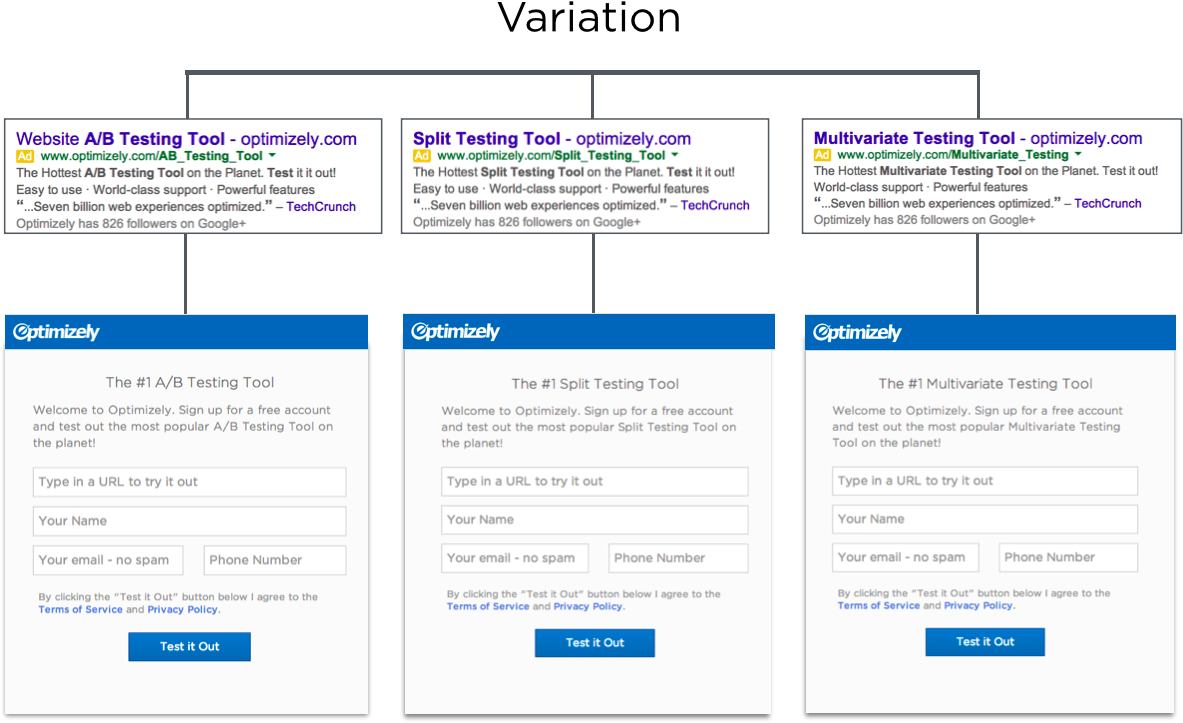
Image source: Optimizely
Where to start:
While you can adjust every landing page to maximize the success of the ad it’s paired with, it’s okay to start small. If your ads are currently going to the same landing page, duplicate that page so that each ad is going to a different one. Then, make minor changes to the headline, benefits copy and CTA to match each page to its ad.
4. Match Audience Intent
When building a PPC campaign, success largely depends on how well you match your audience’s intent. If you have created a paid search campaign before, you know keywords reflect intent.
While filling out campaign information in Google ads, you have to select keywords for your ad. These are the words you think an audience will look up when interested in and receptive to your offer.
Behind an audience’s search queries are four types of intent: navigational, informational, commercial and transactional.
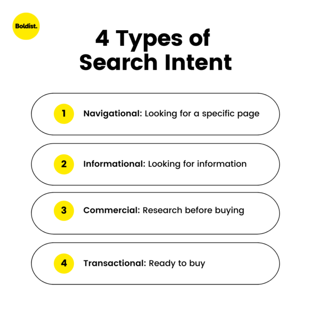
PPC landing page best practice is to make sure your landing page matches the intent you have established.
If you want the consumer to consider your product as they do research, your ad and landing page should have commercial intent.
If you want them to buy right now, they should both be transaction-focused.
You don’t want to direct commercial intent to a transactional landing page because the consumer isn’t ready to buy and will leave.
Sometimes PPC campaigns target consumers early in the funnel, but ecommerce landing pages are often transactional since they are trying to sell products.
On another note, you want to ensure that the benefits on your landing page make sense in response to the queries you’re ranking for.
Where to start:
Review the keywords your ad is ranking for and group them into the four types of intent. Refocus your targeting to match one kind of intent if it doesn’t already, and ensure your ad and landing page speak the same language.
If you’re unsure how to find the most effective keywords for your campaign, you can try a keyword research software like SEMRush or Ahrefs or consult a PPC management service.
5. Make Page Navigation Natural
Part of designing an effective PPC landing page is making it easy—nay, natural—to consume. You want to guide viewers’ eyes to the most important information and call to action.
One tip to help declutter your page, improve its design and avoid overwhelming your audience is to use white space between design elements. White space is where there is nothing, and you can use it to break up page elements strategically.
It’s also easy to get excited about fancy design elements, but it’s important to put the message first. Good landing page design sells because of its ability to boost your professional image and emphasize your message, but too many distractions detract from copy.
How Do You Organize a Landing Page?
When organizing a landing page, start by placing the most important information towards the top, where it’s easy to find. Make sure your CTA pops at the end, and include the same CTA throughout if your page is long. For everything in between, use visual hierarchy to direct viewers’ eyes.
With visual hierarchy, you rank your most important page elements and then design the PPC landing page so that the audience looks at these items first.
Good web designers are familiar with common patterns people follow when looking at landing pages, such as the “F-pattern,” and know how to take advantage of these tendencies.
Heatmaps are an excellent tool for analyzing how people read your pages and which elements get their attention.
You can also use directional cues, implicit or explicit, to guide attention.
Explicit cues include design elements like arrows. Implicit cues include the eye gaze strategy (when an image subject is intentionally positioned so that their gaze appears to be looking somewhere on the page).
One study’s results showed that gaze could be as effective as an arrow in directing attention. To use this landing page strategy, position any picture of a person that you’re using so that their gaze looks toward a vital piece of copy.
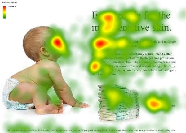
Image source: InVision
Should Landing Pages Have a Navigation Bar?
Landing pages should not have a navigation bar, and getting rid of your website’s nav bar can increase landing page conversions by 100%. This is because exit points like navigation bars and links encourage your audience to leave the page and become distracted.
Still, we understand that no navigation can be hard to commit to. You start to wonder things like, “What if they want to explore the rest of my website or look for something else?”
Remember, your landing page has one goal, and that goal is the whole point of your campaign. So, make it your focus.
As long as your landing page matches the person’s intent when they clicked on your ad, you’re giving them what they want, and you’re good to go.
6. Make Your Headline Count
Surely you’re no stranger to the importance of a first impression.
Well, your headline is your first impression.
The typical web user leaves a web page within 10 to 20 seconds, and the key to earning a longer visit is a strong value proposition.
Thus, a good headline either provides the value proposition or is intriguing enough to encourage readers on to the following line, where the proposition is. (It shouldn’t be any further down the page than that).
To ensure a powerful proposition that the reader cares about, you’ll want to sell the main benefit of your product. Specific features shouldn’t come into play until later. They need to know why they should care first.
Benefits tell potential buyers who they could be with your product.
Use a benefit that relates to the search query that led the visitor to your landing page.
Where to start:
Sell the same primary benefit in your ad and landing page headlines. If you have several benefits of equal value to promote, consider using a separate landing page and ad combo where each targets one of the benefits in the headline.
If you can’t use the exact keywords you’re targeting in your headlines (because keywords rarely make the best headlines), brainstorm headlines around the keywords’ theme.
7. Respond to All Questions and Objections
To get people to buy your product, you have to first make them feel safe purchasing it. Let them know they are making the right decision.
To accomplish this, we recommend one of our favorite PPC landing page best practices: start with a list of everything the buyer is skeptical of and needs to know.
Site copy should be brief, but not at the expense of leaving questions and objections unanswered.
Common questions to answer on ecommerce landing pages include:
- Does this site have what I’m looking for?
- Can I trust this site?
- What if I don’t like the product? Is there an easy return policy?
- How much does it cost?
- What are my shipping options? Is it expensive? Timely?
Some questions may depend on your product:
- For fashion: Will it fit me? How do I know I’m getting the right size?
- For cosmetics: Will it look good on me?
- For food: Will it taste good?
- For decor: Will it look good in my home?
These are a few industry examples, but the exercise remains the same no matter what you sell.
We also want to emphasize the importance of being upfront about shipping and cost: it makes it easier for the customer to trust you and less likely that they will bounce at checkout.
Just a few days ago, I saw an ad for a company with a tasty-looking product that shan’t be named. I remember because I was particularly excited to buy their product. (What can I say? They had me.) I even stormed into the other room to share my discovery.
But a few minutes later, I returned sulking to share that I wasn’t going to purchase it after all.
As it turned out, it was a subscription product that would charge me automatically every month. I only knew because I saw the microcopy under the purchase button at checkout.
If only they had told me earlier—had sold me on that part of the product—I might have been convinced. I wouldn’t have felt tricked, and they would have made a sale.
Where to start:
Put yourself in your customers’ shoes and make a list of everything you would want to know or might feel skeptical about. Better yet, if you can, run a study and ask your customers themselves. Prioritize these concerns and briefly address each on your landing page.
8. Stick to One Very Clear CTA
The call to action is one of the most critical parts to get right to optimize landing pages for conversions. The CTA button is the final step, and if it even mildly confuses visitors or is hard to find, it won’t convert.
Be sure to follow these CTA rules:
- Choose one and stand by it: Landing pages should have one goal, and therefore, one CTA. Having too many distracts consumers and leads them away from the goal at hand.
- Make it easy to spot: Use design elements that help your CTA button stand out, including contrasting color, size and familiar CTA shapes.
- Use it as often as necessary: Short landing pages may require only one CTA, but for longer landing pages, it can be wise to place your CTA (always the same one) throughout. This increases visibility in case someone is ready to convert before reaching the end.
- Write descriptive CTA copy: CTA copy should match your offer exactly and tell visitors what they’re getting out of clicking. For example, use “Buy Now” or “Get My Free Sample” over “Submit.”
Decide on the goal of your PPC landing page before writing or designing it, so the page remains focused and builds up to the CTA.
9. Get Picky With Image and Video
One of the top landing page best practices, particularly for ecommerce landing page optimization, is to provide high-quality photos and videos.
Great product images and videos increase engagement and help answer consumer questions and concerns, as discussed in tip 7. Unsurprisingly, 96% of consumers find product videos helpful when trying to make a purchase decision.
On the flip side, poor-quality pictures or videos will cast doubt on the quality of your products, which is why it’s best to be picky. Our guide to product videos can help, but we highly suggest hiring professionals if you don’t have the resources or expertise to create a video yourself.
You might also consider using user-generated images to add more personality and trust to your landing pages, but pickiness is important on this front as well.
Where to start:
Prioritize getting photos of your product at every angle and depict how it works in everyday life. This allows viewers to get a real sense of what it looks like and to picture using it for themselves. Take clear, professional photos and use a clean backdrop.
10. Decide on Content Before Design
It’s not uncommon for landing pages to start with design. A designer might create a wireframe that outlines the page and have the writer fill it in.
This method can waste time and isn’t the best way to optimize landing pages for conversions.
Starting with design limits the writer in what to include, how much to include, and where to include it. This is a problem because copy is what sells a product. Design is meant to accentuate copy–not the other way around.
You may also come across a situation where the writer has to suggest a new design to suit the content needed. Then the designer has to do more work than if they had the content handy from the beginning.
Where to start:
Let the copywriter start with copy. Once you have a solid draft, the designer can begin and know what they’re working with. To avoid silos, keep an open dialogue between your writers and designers throughout the process.
11. Make Credibility a Priority
Trust is a big deal in ecommerce. More people may buy online than ever, but most won’t purchase until they are sure they can trust you and your product.
Many of our PPC landing page best practices thus far will contribute to your credibility, but you can use the following tips to help convince the most careful of consumers:
- Use testimonials and reviews, but only the best.
- Add badges and awards if you have them.
- Highlight proof in the form of performance figures, data and case studies.
- Share the number of users or downloads if applicable.
- Be upfront about how you use form data.
- Provide contact information.
Clean design also works wonders for professionalism. Research into what determines visitors’ initial trust in a website revealed that 94% of visitors’ first impression comes from design factors.
Where to start:
Add any of the above bullets that apply to your product, and consult an ecommerce-focused web design company, like Boldist, to evaluate your landing page design.
12. Actively Choose Between a Short or Long Landing Page
If you’ve interacted with landing pages before, you may have noticed that some are much longer than others. We can tell you that if they were good landing pages, this was a strategic decision.
To determine the appropriate length for your PPC landing page, you’ll want to consider the product, the audience’s familiarity with it and how much of a commitment you’re asking them to make.
Short landing pages are best for:
- Small commitments, like newsletter signups or free resources.
- High-familiarity, where users have prior experience with or knowledge of a product.
- A high conversion rate but less qualified leads.
Long landing pages are best for:
- Big commitments, like luxury purchases.
- Low familiarity, like a new service or invention.
A long landing page may make fewer conversions than a short one, but only because the goal is different. It’s harder to convince users to buy a laptop than to offer up their email.
In regards to large purchases or convincing someone to try a new service, you will have more success with a long landing page than a short one because potential customers will have more questions and concerns to address.
Where to start:
Ask yourself how much convincing a lead needs to convert. Evaluate how familiar they may be with your product and how unique your product is, as well as the price you are asking them to pay. As long as you’re answering all of their questions, you’re on the right track.
13. Optimize Above the Fold
No matter the length of your landing page, above the fold is special territory.
The fold of a landing page where the screen ends, so a visitor can’t see any more of the page without scrolling. In other words, above the fold is the part of your landing page that your audience sees when they first arrive.
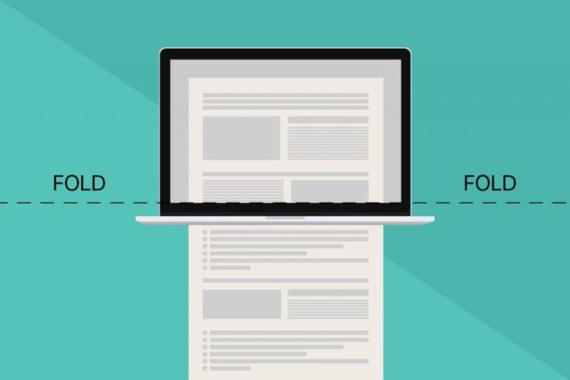
Image source: Icons8 Blog
While there are design and copy practices meant to encourage users to scroll past the fold, the simple fact is that it’s where visitors spend most of their time. According to Nielsen Norman Group research, page visitors spend 57% of their time above the fold and 74% of their time within the first two screenfuls.
This is all to say that you should think carefully about what you place above the fold.
Where to start:
Check your landing page on all devices to see what portion of it falls above the fold. Place the most important information above the fold, and encourage users with great copy and strategic design to scroll to the rest.
14. Minimize Where You Can
In a world where everyone vies for our attention, we have learned to skim and be selective.
As a result, if you want visitors to read and retain what you put on your landing page, best practice is to minimize, minimize, minimize.
There are two rules for reducing content on a PPC landing page:
- If it doesn’t add significant value, get rid of it.
- But don’t remove content at the expense of value.
If you are super concerned about cutting information, adding a live chat solution for potential buyers may help.
And we can’t stress it enough: clean and simple design is pleasant on the eyes and more likely to be consumed.
Where to start:
Go through your landing page line by line and ask yourself if every sentence adds value and if it can be shortened or simplified without losing value. Then, do the same thing for every design element.
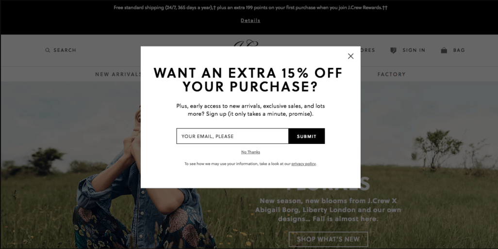
15. Remove Pop-Ups
Pop-up campaigns are everywhere these days.
Growing your newsletter? Pop-up.
Running a sale? Pop-up.
Have a rewards program? Pop-up.
A well-done, minimally intrusive pop-up can work wonders, but all too often, they are left to POP! on every page. This is a problem for landing pages because it distracts and doesn’t play by the rule of one goal.
Now, if too many people are bouncing off your landing page, you might consider adding an exit intent pop-up like the one pictured below. These appear when a user indicates intent to leave your page and serve as a “Wait! Before you go….”
While an exit intent pop-up can help, reworking and optimizing your landing page to engage visitors should take priority.
Where to start:
This one is easy. Start by deactivating any pop-ups on your landing pages.
16. Qualify Your Audience
If you’ve been running your business or marketing one for very long, you probably know how important it is to define your target audience. You want to appeal to the right people.
What can easily slip past is that your audience has to work for you, too.
And sometimes, the wrong person makes their way to your landing page only to waste your budget and skew your data. This is why you want to qualify your landing page leads.
A qualified lead doesn’t just visit your website but also indicates a high chance of converting. Their behavior suggests that a purchase is likely, and for that reason, they should be your focus.
Qualifying your leads will help you:
- Save your marketing budget for the right leads and maximize your return
- Ensure you’re using the correct data to optimize your strategies
- Define and prioritize customers likely to become repeat buyers
Where to start:
Begin to collect data on your landing page visitors—those who convert and those who don’t.
If you have a lot of data, a CRM can help you store it and predict the customer lifetime value of your leads.
Use the data you gain to analyze the effectiveness of your targeting and to prioritize who you retarget. If most leads are bad prospects or a landing page has high bounce rates, your targeting strategy or landing page will need a change.
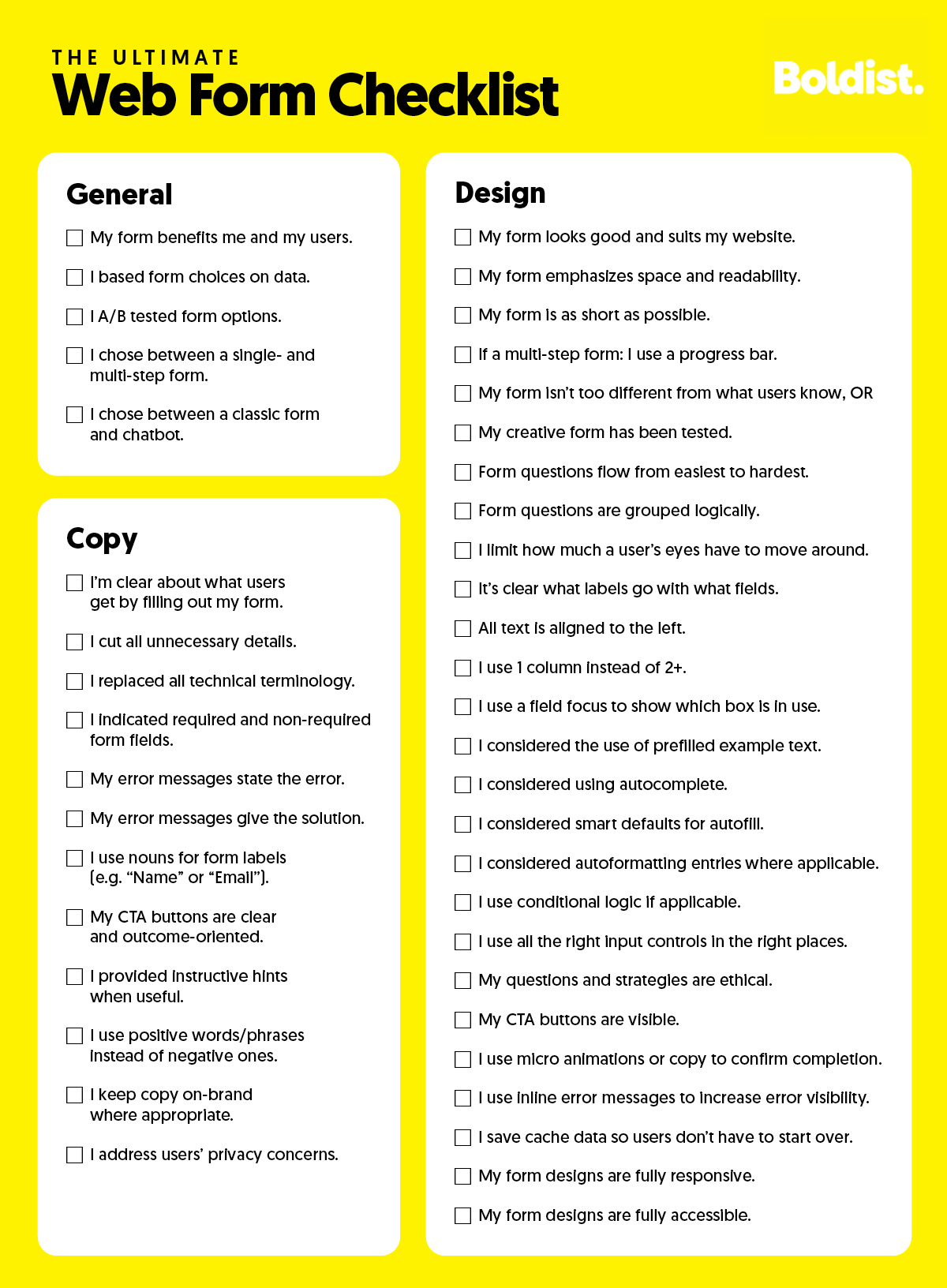
17. Simplify the Checkout Process
Earlier, we said that the CTA was the final step in conversion, but that’s not entirely true.
A poor checkout process can turn off even the most excited of potential buyers.
Maybe the design is confusing, it asks for a suspicious amount of data without explanation, or the error message copy sucks. These are but a few reasons why we abandon forms.
To encourage users to complete your checkout process, you will want to design it well, keep directions clear, and make it as easy to use as possible.
Popular strategies for simplifying the process include using social log-ins through Facebook and Google or auto-filling form data. You may also link form fields with users’ keyboards to switch between letters and numbers automatically as needed. (For instance, when switching from email to credit card input).
User testing is a great way to see where your checkout process may turn away potential buyers.
In a stunning turn of events, Gumroad added one field to their payment form and increased conversions by 30%. The field? It only asked buyers for their names, but it was enough to make the form feel more genuine.
Where to start:
Use the infographic checklist below to optimize your checkout process. If interested, you can read more on these tips in the full blog on how to increase form submissions.
18. Optimize for Mobile
The number of mobile buyers in the US is expected to reach 187.5 million by 2024.
There’s no more asking whether it’s worth it to create a responsive website (that is, one that automatically adjusts content to the size of the screen it’s viewed on).
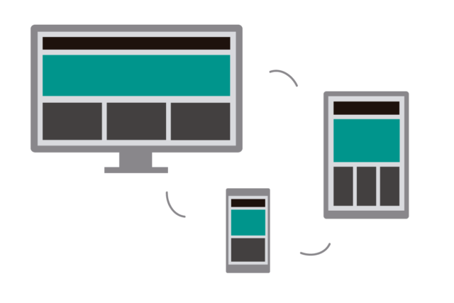
Image source: awwwards
Optimizing for mobile, however, is a different thing.
Optimizing for mobile means making the extra effort to enhance a mobile user’s experience. Just because the content fits the user’s screen doesn’t always mean that the same design will be the best for landing page conversion optimization on a mobile device.
Sometimes a minor redesign can help to maximize the new fold, encourage scrolling or take advantage of different mobile patterns.
Sometimes creating an app is a beneficial option.
Google Ads suggests working with your ecommerce web developer to decide if your pages can get by with responsive design or if a different version of your site is needed.
If you choose to create a mobile site, we recommend being careful about reducing content. Many people suggest reducing the content on mobile sites, but if you follow tip 14 (minimize where you can), you should already have reduced your page content to the essentials. Thus, removing anything would be removing valuable content.
If you can justify removing something, ask yourself why it’s on the regular version of your site to begin with and if it should be there.
Where to start:
Test your PPC landing pages with Google’s mobile-friendliness tester and review them on several devices. You might also check your Google Analytics reports to see if page visitors on mobile devices are bouncing or converting at different rates compared to desktop users.
If you find that your mobile pages could look or convert better, see if we can help.
19. Personalize With Care
Personalizing your landing page experience to stimulate a customer’s unique desires and background will result in more conversions.
Still, not every personalization tactic will reap benefits, and it’s easy to personalize too much, especially with someone who has never been to your website before.
For example, using someone’s first name when they have never given it to you will raise flags.
Instead, be subtle, and be honest.
If you’re local, you can make local references. If you’re not, you can still promote different products to buyers in different regions without mentioning it.
Another landing page strategy is to optimize pages by demographics. You might offer luxury dresses to women and men’s suits to men, for instance.
Where to start:
Before you can personalize campaigns for audience segments, you’ll want to make sure you’re collecting the right data and able to target with precision. Then, use geo customizers for location targeting and demographic filters for targeting based on age or gender.
Another good place to start is creating a specialized campaign for retargeting landing page visitors who didn’t convert or those who did and may be interested in a complementary product.
20. Sprinkle in Some SEO
Add a touch of SEO, and there’s a chance that some lucky individual will come by your page organically. There’s no rule that says you can’t try to get clicks without paying, too.
Where to start:
To optimize your page for search engines, start by adding the search intent keywords you selected above to your headers, body copy and meta description. Make sure not to overstuff them to the point that it feels unnatural.
Then, go ahead and use descriptive image titles and alt text as well.
21. Test Variations (Within Reason)
Few things are more exciting than releasing your PPC landing page into the world, eagerly awaiting its success. But don’t call it a day. Or do, but be prepared to come back next week.
PPC landing page best practice includes testing variations of page elements over time to ensure you’re using the most conversion-optimized version of your page. Sometimes another header or design converts better.
That said, don’t get bogged down in testing either. Prioritize and be efficient. Remember that if you test a headline and CTA and then combine the best two, the context was different in testing than in your final form.
Where to start:
Conduct A/B or multivariate tests. A/B testing lets you test two different pages against each other. Multivariate testing tests multiple elements on a page in various combinations to find the best combo.
22. Study Your Google Analytics
Analytics are your best friend. Even if you’re not testing different landing page variations against each other, review your analytics often to monitor how well your campaign is doing.
Use the goal you set for your landing page as the primary success metric, but feel free to evaluate bounce rates and other key performance indicators as well.
Where to start:
Google Analytics (GA) is the standard service for monitoring your page metrics. Outside of impressions and clicks, you can use GA’s behavior and flow reports to see where visitors come from and where they go on your page for extra insight.
Use what you find in Google Analytics to improve your user experience.
23. Retarget Lost Opportunity
Not everyone who leaves your page is uninterested in what you have to offer. Sometimes they get busy or distracted, plan to come back later or just need a little more convincing.
This is the power of retargeting: the option to target those who already visited your website or landing page.
Where to start:
Begin by choosing which platforms you want to retarget visitors on. Google and social media platforms, like Facebook, offer retargeting options.
From there, you’ll add a “tag” to your page provided by the platform(s) you chose. The tag will track visitors and alert the platform to send them your ads.
Make sure you don’t retarget people who have already converted unless you’re retargeting them for a different product.
24. Create a Sense of Urgency
A sense of urgency is an effective tactic used by many online retailers to increase conversions. If you’ve shopped online before, then you know how easy it is to say you’ll buy it later or sleep on the decision. With a sense of urgency present, you’re more likely to convert before it’s “too late.”
Examples of creating urgency are sales or deals that last for a “limited time” or products that are available “while supplies last.”
Where to start:
Think about whether you have any upcoming deals that you can use the above tactics for. If not, consider what types of urgency work with the product you’re promoting.
Fashion retailers can add hints of limited supply by providing a section that says how much of a product is left (e.g., “5 left in stock”). For one-of-a-kind items, like art or an Airbnb listing, you might say “5 other people have this saved” or “5 people have their eyes on this.”
25. End With a Thoughtful Thank You Page
Not only is it human and polite to say thank you, but a thoughtful thank you page for your customers is a great place to offer more value.
You can give them details on what to expect or how to use the product once it arrives, or you can take the opportunity to promote products related to their purchase.
Another option is to add some of the links you desperately wanted to put on your landing page but had to remove to follow the one CTA rule.
Where to start:
No matter what you add to your thank you page, always start with actually saying thank you. Tell your customer you appreciate them.
Then, think about how you can bring them value. If you ask customers to follow you on social or join your newsletter, tell them how they will benefit. If you try to sell another product, make sure you have reason to believe they want it.
Waste Not: Upgrade Your PPC Landing Pages
It’s easy not to bother with a PPC landing page because it takes work.
Maybe a casual attempt copying another brand’s design is simple enough. But a good landing page takes effort, and when promoting an ecommerce business, there is rarely the time or resources to create a good landing page internally.
To create the PPC campaign alone, you need an ads expert and writer. For the landing page, you need the skills of a writer, designer and developer. It’s easy to get overwhelmed.
We hope you’ll learn by implementing these PPC landing page best practices that small changes can make a big difference, and even big changes can start small.
If you find that even the smaller landing page tips in this article are too much to take on or that you desire hands-on guidance from an expert, let us know. We’d love to do more to increase your conversions.